Further Complications

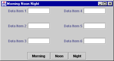
Here is our example user interface,
now with even more features.
The user has elongated the frame, so the
labels and buttons are automatically arranged horizontally
(by FlowLayout).
The three buttons at the bottom should be grouped together. The label/button pairs should be put into left and right panels as before. But now there is a problem with the button panel. if horizontal alignment is used for the frame's content pane, then the button panel will be placed at the right--not where we want it. But if vertical alignment is used, then the left and right panel are incorrectly placed.
