Further Complications

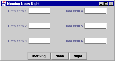
Here is an example user interface,
now with even more features.
The user has elongated the frame.
FlowLayout used the extra space
to create a horizontal arrangement of the
labels and textfields in the six small panels.
The three buttons at the bottom should be grouped together. The label/button pairs should be put into left and right panels as before. But now there is a problem with the buttons. How should they be added to the GUI?