HTML provides a number of tags that create inputs that a client may use to send data to a server. When using these inputs, they must be grouped together as a unit so that the client's browser knows what to do with all of the data. This grouping is called a form.
For our exercise/lesson today, we will simply be examining the components that are available for a form. First, we have to lay the foundation for the form. Open Dreamweaver and if a new web page is not open, from the File menu select New, and then from the window that opens select Basic Page.
To insert a form into your web page, click on the new form button. A dashed red line should appear indicating the region where the form will be contained.

If you open the code view on Dreamweaver, you should also see some code inserted. This code indicates the beginning and ending tags of the form along with the critical form attributes.
<form name="form1" method="post" action="">

  </form>
Remember that we will be using the form's name to uniquely identify it from other forms in a single web page. The method shows how data will be sent to the server if a "Submit" button is pressed, and the action is the server and file that will handle our form's data.
Just like laying the foundation of a table or other HTML object, a form is defined using beginning and ending tags. All of the components that make up the form (i.e., items that the client can click, type, or scroll on) must be contained between these two tags. The majority of the components are defined with the <input> tag. The <input> tag has a number of attributes, but primarily it uses:
The table below lists most of the table components along with the tags that create them.
Use the items in the table above to see how each component reacts to input. The submit button will not work because there is no action associated with sending the client data to a server.
Exercise 1:
Using the components found in the Forms toolbar, we are going to add:
We are also going to set up an action and a method so that you can receive some response to your form when the user presses the submit button.
First, let's set up the action and method. From the code view, do the following:
Notice that the two steps above can also be accomplished by editing the fields in the properties window at the bottom of your Dreamweaver screen.
Next, insert the components to create this form.


Repeat the previous steps in order to create a text field that allows the user to enter their e-mail address. Name the field "email" instead of "name" and change the initial text to show that the user should enter their e-mail here.
To create a password entry, repeat the previous steps for the text fields. Name the field "pw", but this time leave the initial text blank. Once this is set to a password input, any text added here would simply show up to the user as ******. In the properties box, be sure to select the radio button labeled password.
Without a submit button, the form will do nothing except allow the user to input data and stare at it on their browser. To send the data, we need to add a submit button.


<input name="sub" type="submit" id="sub"
    value="Click here to send data">
Last of all, be sure to add text next to each of the form components to direct the user as to what the different fields represent.
Save this file to your local disk, and open it in the browser of your choice. Enter some data and see what happens when you click on the submit button.
The window that comes up in response to the submit button gives you a great deal of information about the form you just created.
| The following fields were sent via GET |
| The following fields were sent via POST | |
| name | Type your name here |
| Enter your e-mail address here | |
| pw | abcdefg |
| sub | Click here to send data |
| The following fields were sent via a Cookie file |
Edit your form so that the method is "get" and see what changes. Remember that the get method simply means that the data is sent along with the URL, so after you submit the data, examine the URL/location field on your browser window to see how the data was sent. It should look really odd, sort of like:
http://csciwww.etsu.edu/tarnoff/labs1710/forms/formresponder.asp?name=Type+your+name+here&email=Enter+your+e-mail+address+here&pw=abcdefg&sub=Click+here+to+send+data
Examine this URL to see that all of your data is contained in this string.
Exercise 2:
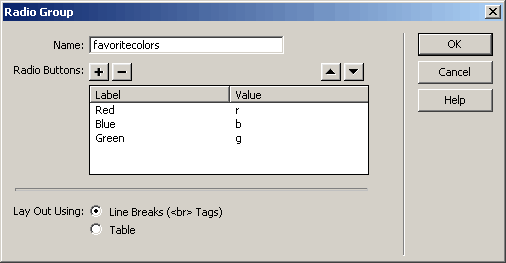
Bring up a new page in Dreamweaver. Insert a form to give you the container for all the form components we will be creating. Be sure to set the form method to "post" and the action to the same URL that we used in exercise 1.
Now before we insert the components, let me make sure everyone knows about this type of component. In the OLDEN DAYS, car radios had buttons to select which radio station the user wanted to listen to (much like they do today). The difference is that those old buttons were mechanical and stayed pressed in to indicate which station was selected. When a different button was pressed, the old selection popped out.
Radio buttons on a form are the same way (less the mechanical part). A group of buttons can be grouped together so that only one button "stays pushed in".


<input type="radio" name="favoritecolors" value="r">| The following fields were sent via POST | |
| favoritecolors | b |
| sub | Submit |
Exercise 3:
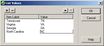
Now, let's create a form with a drop-down menu, sometimes referred to as a "select menu"). Bring up a new page in Dreamweaver and insert a form.


Exercise 4:
Sometimes, forms look a little messy. Using Dreamweaver, create the form below using <br> to separate the components. (Hint: Holding the shift-key down while pressing return inserts a <br> break rather than a <p> return.)

How does it look? Like heck, huh? Well, standard HTML tags can be used within a form. One solution here might be to use a table to better arrange the form components. Inside the table, insert a 5 row by two column table.
Now, move each of the components into the table so that they are arranged with a little more order.
Now, use the table alignment attributes to align the parts the way you want them to be arranged. Also, turn off the borders so that the user doesn't see the lines. You should have something that looks like this:
Created by David L. Tarnoff for use by ETSU CSCI 1710 and CSCI 5011 students.