 | Information Architecture for the World Wide Web |  |

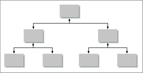
As discussed in the previous chapter, hierarchy is a familiar and powerful way of organizing information. In many cases, it makes sense for a hierarchy to form the foundation for organizing content in a web site. However, hierarchies can be fairly limiting from a navigation perspective. If you have ever used the ancient information browsing technology and precursor to the World Wide Web known as Gopher, you will understand the limitations of hierarchical navigation. In Gopherspace, you were forced to move up and down the tree structures of content hierarchies (see Figure 4-3). It was not practical to encourage or even allow jumps across branches (lateral navigation) or between multiple levels (vertical navigation) of a hierarchy.

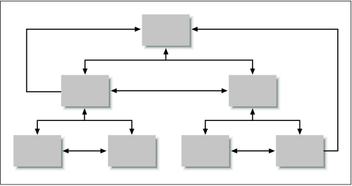
The Web's hypertextual capabilities removed these limitations, allowing tremendous freedom of navigation. Hypertext supports both lateral and vertical navigation (see Figure 4-4). From any branch of the hierarchy, it is possible and often desirable to allow users to laterally move into other branches. For example, as you explore the Programs and Events section of a conference web site, you may decide to register for that conference. A hypertext link should allow you to jump to Registration without first retracing your steps back up the Programs and Events hierarchy.

It is also possible and often desirable to allow users to move vertically from one level in a branch to a higher level in that same branch (e.g., from a specific Program back to the main Programs and Events page) or all the way back to the main page of the web site.
The trick with designing navigation systems is to balance the advantages of flexibility with the dangers of clutter. In a large, complex web site, the complete lack of lateral and vertical navigation aids can be very limiting. On the other hand, too many navigation aids can bury the hierarchy and overwhelm the user. Navigation systems should be designed with care to complement and reinforce the hierarchy by providing added context and flexibility.

Copyright © 2002 O'Reilly & Associates. All rights reserved.