 | Web Design in a Nutshell, 2nd Edition |  |

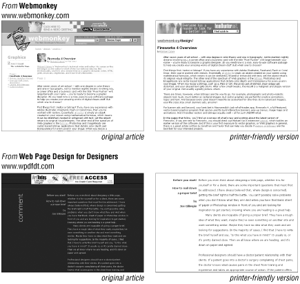
One way to ensure that your users can get a good copy of your content to-go is to link to a separate "printer-friendly" HTML document especially for printing. In general, printer-friendly pages are stripped-down versions containing just a single column of content with minimum HTML formatting. Figure 5-1 shows pages from two web developer resource sites and their corresponding printed pages.

The following sections detail some steps you can take to design printer-friendly pages. Of course, if you anticipate that your audience will want to do a lot of printing from your site, you may choose to design your original pages according to the same printer-friendly guidelines.
The most common problem with printing web pages is that the right edge can get cropped off. This happens when the page is fixed at a pixel width (using a table) or contains graphics such as a navigation bar that is wider than the printable area of the page.
So how wide is too wide? If you want to be absolutely sure that no content slips off the edge for anyone, keep the width of tables and graphics under 550 pixels. An even more conservative approach is to use HTML text only (with no tables fixing the page width) and only minimal graphics.
Browsers that shrink the page to fit the printable area can accommodate any page width, but you risk the contents becoming too tiny to be legible, so it's best to keep tables and images under 750 pixels wide.
Another tip for keeping web pages fit to print is to use black (or dark) text on a white (or light) background. Some older browsers are known to print out dark backgrounds and the text black as well (even though it is white on the screen), resulting in a solid field of black on the paper.
While browsers are now more capable of printing colors as they are seen on the screen, in general, your printer-friendly version should be designed to look like a printed document, with dark type on a light background. It saves on toner as well!
While many home users print to color inkjet printers, people in offices are more likely to be printing on black-and-white laser printers. For this reason, printer-friendly pages shouldn't rely on color output for communication.
If you are taking the time to create a separate printer-friendly document, you should tailor the content of that document to be appropriate to the medium. Consider why the user is printing out the web page and how it is going to be used. Chances are, people just want the content of the page for later reading or filing. Following are some things to consider when assembling your page:
If your readers are interested in content (such as an article), you can strip out anything extra on the page, including navigation, search boxes, etc. Whether you include ads may be more of a marketing mandate than a design decision, but in general, they should be left out too.
The print document should have some way of identifying where it came from for future reference, including the site name and subsection labels when appropriate. It doesn't hurt to write out the URL if it is not clear, in case users don't have headers and footers turned on in their printouts.
If your article is divided across several web pages, combine it into one printable document.
On a printed page, hypertext links are useless, of course. Where the original article contains linked text, consider writing the complete URL for the link in parentheses after the linked word. That way, a reader can type in the URL to follow the link later.
If your content pages are generated dynamically from a database, create a template specifically for printer-friendly versions. This prevents needing to make two HTML files for every page.

Copyright © 2002 O'Reilly & Associates. All rights reserved.