 | Web Design in a Nutshell, 2nd Edition |  |

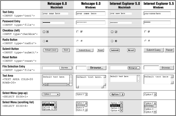
A <form> element tends to be rendered by the browser, giving the designer little control over the appearance of the controls themselves. Not surprisingly, the same element may be rendered slightly differently on different browsers and platforms, as shown in Table 15-2.
If you really need to know the exact pixel dimensions of a form element on a specific browser or platform (perhaps for mock-up purposes), you can thank the fine folks at Webmonkey.com. They have taken the time to measure every last form element (among other browser display features) down to the pixel, and they posted their findings at http://hotwired.lycos.com/webmonkey/99/41/index3a_page5.html. Knowing the largest possible dimensions for a form element may be useful in planning a page layout.
Navigator resizes form elements containing text (text fields, text areas, and scrolling lists) when the constant width font is resized in the browser preferences. So if a user's fonts are set to 18 points, a <textarea> could suddenly become huge and exceed the space you've allotted. Like many things on the Web, the way your forms will look is somewhat unpredictable.

As for any HTML element, you can use Cascading Style Sheets to alter the font, colors, and size of form controls. Unfortunately, CSS formatting will be lost on all but the most recent standards-compliant browsers (Internet Explorer 5.5 and Netscape 6). All other browsers ignore CSS styles for form controls and display the generic control (they'll still function just fine). For more information on how style sheet properties work, see Chapter 17, "Cascading Style Sheets".
One method for adding style information to a form element is to embed the style sheet right in the tag. The following example creates a black submit button with white text in the Impact font face (Figure 15-14):
<INPUT TYPE="submit" VALUE="SUBMIT" STYLE="font-family: Impact;
 color: white; font-size: 14px; background: black">.
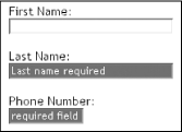
You can also use the class and id attributes to apply styles to specific controls. Cascading Style Sheets rely on the class attribute to differentiate between input elements. In this example, a style sheet is used to highlight the required fields (last name and phone number) in a very simple form (Figure 15-15):
Style information in head of document
<STYLE TYPE="text/css">
<!--
input.required { background-color: darkred; color: white }
-->
</STYLE>

In the form...

<P>First Name: <BR>
<INPUT TYPE="text" NAME="first" SIZE="30"></P>
<P>Last Name: <BR>
<INPUT TYPE="text" NAME="last" SIZE="30" CLASS="required"></P>
<P>Phone Number: <BR>
<INPUT TYPE="text" NAME="number" SIZE="12" CLASS="required"></P>
Style sheets can be used to apply color to any form element, including checkboxes, radio buttons, specific options within menus, etc. You can even use them to specify the size of text entry fields in specific pixel dimensions (using the width and height properties), making it easier to predict page layouts. The only problem at this time is browser support. Because only the very latest browsers are on board, it will be a while before we can rely on these techniques for important interface cues.
A page with lots of form elements can get ugly in a hurry. The best favor you can do for a form is to align the elements in some orderly fashion. There are two methods for doing this: using the <pre> tag and using a table.
Unlike standard HTML body text, preformatted text (delimited by <pre> tags) is displayed exactly as it is typed in, honoring multiple character spaces and line breaks. Using characters wrapped in <pre> tags has long been a favorite cheat for aligning elements on a web page, going back to the Web's infancy.
If you put your entire form within <pre> tags, you can align the elements by columns of characters. The drawbacks to this method are that it does not offer much flexibility for page design and it may be tedious work. Another disadvantage is that any text displayed near the form elements will use a monospace font. The advantage to putting your whole form within <pre> tags is that it will be viewed the same way by all users, even those using browsers that don't support forms in tables (early browser versions, especially early versions of the AOL browser).
Tables are really the best tool available for tidying messy form elements. There is nothing special about tables used for forms; the same principles and guidelines outlined in Chapter 13, "Tables" apply for this use. However, there are a few points to keep in mind for better results:
Form elements tend to be rendered with extra space above and below. This can be problematic when trying to fit a form into a tight table cell. If you want to lay out a form with a table, it is better to put the <table> element within the <form> element instead of the other way around. Forms can contain all sorts of page elements, so it is not a problem for one to span over more of the page than just the form element. If you must put a form within a table, be sure to give it plenty of space.
Remember that form elements that contain text (text entry fields, text areas, and scrolling lists) will resize in Navigator relative to the constant-width font size as set in the browser preferences. This is especially treacherous when form elements are placed in a meticulously sized table, as shown in Figure 15-16.

As mentioned earlier, browsers automatically generate form elements such as pull-down and scrolling menus; however, there are a few ways in which you can tweak their appearance.
First, your page may look neater overall if your menu elements are all the same width so they align nicely. The width of a menu element is automatically determined by the item with the most number of characters in the list. (The size attribute affects only the list's height.)
One way to give your lists the same width is to create a dummy option item (<option>) within each list and make it the desired width by filling it with a number of nonbreaking spaces ( ) or hyphens (-).
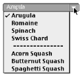
A dummy option item containing only a number of hyphens can also be used as a divider within the list. Select menus can not contain horizontal rules (<hr>), so adding a row of hyphens is the closest you can get to dividing the list items visually into groups, as shown in Figure 15-17.

The trick to doing this successfully is to make sure that if the user selects your dummy row (and there's nothing that can prevent users from doing so), the information will not be transferred to the server. The desired effect is to make it seem like nothing happens. This can be accomplished with JavaScript code such as the following, contributed to this book by Martin Burns of Edinburgh, Scotland:
<SCRIPT>
function checker(selector) {
  if(selector.options[selector.selectedIndex].text = '---------------') {
    selector.options.selectedIndex = selector.options.defaultIndex
  }
</SCRIPT>
<SELECT name="brand" size=1 onChange="checker(this)">
   <OPTION selected value="">Arugula
   <OPTION>Romaine
   <OPTION>Spinach
   <OPTION>Swiss Chard
   <OPTION>---------------
   <OPTION>Acorn Squash
   <OPTION>Butternut Squash
   <OPTION>Spaghetti Squash
</SELECT>
Copyright © 2002 O'Reilly & Associates. All rights reserved.