 | HTML & XHTML: The Definitive Guide, 4th Edition |  |

The HTML 4 and XHTML standards provide a number of attributes for the <body> tag that let you define text, link, and document background colors, in addition to defining an image to be used as the document background. Internet Explorer extends these attributes to include document margins and better background image control. And, of course, the latest style sheet technologies integrated into the current browsers let you manipulate all these various display parameters.
The attributes that control the document background, text color, and document margins are used with the <body> tag. Section 3.8.1, "The <body> Tag"
One standard, although deprecated, way you can change the default background color in the browser window to another hue is with the bgcolor attribute for the <body> tag. Like the color attribute for the <font> tag, the required value of the bgcolor attribute may be expressed in either of two ways: as the red, green, and blue (RGB) components of the desired color or as a standard color name. Appendix G, "Color Names and Values" provides a complete discussion of RGB color encoding along with a table of acceptable color names you can use with the bgcolor attribute.
Setting the background color is easy. To get a pure red background using RGB encoding, try:
<body bgcolor="#FF0000">
For a more subtle background, try:
<body bgcolor="peach">
If a splash of color isn't enough, you may also place an image into the background of a document with the background attribute in its <body> tag.
The required value of the background attribute is the URL of an image. The browser automatically repeats (tiles) the image both horizontally and vertically to fill the entire window.
You normally should choose a small, somewhat dim image to create an interesting but unobtrusive background pattern. Besides, a small, simple image traverses the network much faster than an intricate, full-screen image.
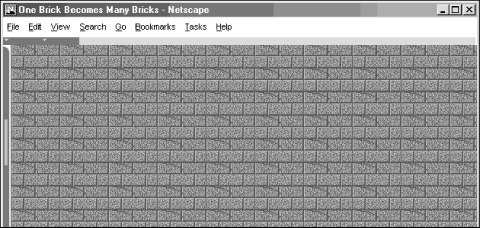
Figure 5-21 shows you how the extended browsers render a single brick to create a wall of bricks for the document background:
<body background="pics/onebrick.gif">
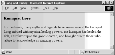
Background images of various dimensions and sizes create interesting vertical and horizontal effects on the page. For instance, a tall skinny image might set off your document heading:
<body background="pics/vertical_fountain.gif">
<h3>Kumquat Lore</h3>
For centuries, many myths and legends have arisen around the kumquat.
...
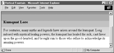
If the vertical_fountain.gif is a narrow, tall image whose color grows lighter towards its base and whose length exceeds the length of the document body, the resulting document might look like the one shown in Figure 5-22.
You can achieve a similar effect horizontally with an image that is much wider than it is long (see Figure 5-23).
The background attribute is deprecated in HTML 4 and XHTML, since you can achieve similar effects using style sheets.
The bgproperties attribute extension for the <body> tag is exclusive to Internet Explorer and works only in conjunction with the background attribute extension. The bgproperties attribute has a single value, fixed. It freezes the background image to the browser window, so it does not scroll with the other window contents. Hence, the example H2Omark.gif background image serves as a watermark for the document:
<body background="pics/H2Omark.gif" bgproperties="fixed">
Once you alter a document's background color or add a background image, you also might need to adjust the text color to ensure that users can read the text. The HTML 4/XHTML text standard attribute for the <body> tag does just that: it sets the color of all nonanchor text in the entire document.
Give the text attribute a color value in the same format as you use to specify a background color (see bgcolor in Section 6.3.1.1, "Allowed content") -- an RGB triplet or color name, as described in Appendix G, "Color Names and Values". For example, to produce a document with blue text on a pale yellow background, use:
<body bgcolor="#777700" text="blue">
Of course, it's best to select a text color that contrasts well with your background color or image.
The text attribute is deprecated in HTML 4 and XHTML, since you can achieve similar effects using style sheets.
The link, vlink, and alink attributes of the <body> tag control the color of hypertext (<a> tag) in your documents. All three accept values that specify a color as an RGB triplet or color name, just like the text and bgcolor attributes.
The link attribute determines the color of all hyperlinks the user has not yet followed. The vlink attribute sets the color of all links the user had followed at one time or another. The alink attribute defines a color for active link text -- one that is currently selected by the user and is under the mouse cursor with the mouse button depressed.
Like text color, you should be careful to select link colors that can be read against the document background. Moreover, the link colors should be different from the regular text as well as from each other.
These attributes are deprecated in HTML 4 and XHTML, since you can achieve similar effects using style sheets.
Peculiar to Internet Explorer, the leftmargin attribute extension for the <body> tag lets you indent the left margin relative to the left edge of the browser's window, much like a margin on a sheet of paper. Other browsers ignore this attribute and normally left-justified body content abuts the left edge of the document window.
The value of the leftmargin attribute is the integer number of pixels for that left-margin indent; a value of is the default. The margin is filled with the background color or image.
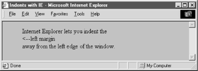
For example, Internet Explorer renders the following text justified against a margin 50 pixels away from the left edge of the browser window (see Figure 5-24):
<body leftmargin=50> Internet Explorer lets you indent the<br> <--left margin<br> away from the left edge of the window. </body>
Like leftmargin, the topmargin attribute extension currently is exclusive to Internet Explorer. It may be included in the <body> tag to set a margin of space at the top of the document. The margin space is filled with the document's background color or image.
Body content begins flowing below the integer number of pixels you specify as the value for topmargin; a value of is the default.
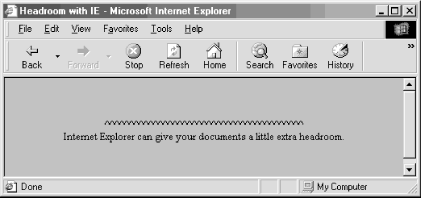
For example, Internet Explorer renders the following text at least 50 pixels down from the top edge of the browser window (see Figure 5-25):
<body topmargin=50>
<p align=center>
^^^^^^^^^^^^^^^^^^^^^^^^^^^^^^^^^^^^^^^^^
Internet Explorer can give your documents
a little extra headroom.
</p>
</body>
You also can set all the various style-related <body> features and then some with Cascading Style Sheets. But although you may include the style attribute with the <body> tag to create an inline style for the entire body content, we recommend that you set the styles for the entire document body at the document level (<style> tag inside the document head) or via a collection-level (imported) style sheet. Use the class attribute and name value to apply the appropriate style of a predefined class of the <body> tag to the contents. (Since there can only be one body per document, what is the point of setting a class name otherwise?) We cover the use of style and class definitions in Chapter 8, "Cascading Style Sheets".
Although background and bgcolor attributes can appear in the same <body> tag, a background image will effectively hide the selected background color unless the image contains substantial portions of transparent areas, as we described earlier in this chapter. But even if the image does hide the background color, go ahead and include the bgcolor attribute and some appropriate color value. That's because users can turn off image downloading, which includes background images, and so they may find your page otherwise left naked and unappealing. Moreover, without a bgcolor attribute or a downloaded (for whatever reason) background image, the browsers merrily ignore your text and link color attributes, too, reverting instead to its own default values, or the ones chosen by the user.
The various color and image extensions work wonderfully, particularly the colorful ones, assuming that all users have a 256-color display, lots of available memory, unlimited network bandwidth, and good visual acuity. In reality, many users have monochrome or limited color displays, limited memory for caching images, extremely restricted network bandwidth, and poor vision.
Because of these limitations, you should seriously consider not using any of these extensions in your documents. Much like early users of the Macintosh felt compelled to create documents using ransom-note typography ("I've got 40 fonts on this thing, and I'm going to use them all!"), many authors cannot avoid adding some sort of textured background to every document they create ("I've got 13 wood grains and 22 kinds of marbling, and I'm going to use them all!").
In reality, except for the very clever ones, texture-mapped backgrounds add no information to your documents. The value of your document ultimately lies in its text and imagery, not the cheesy blue swirly pattern in the background. No matter how cool it looks, your readers are not benefiting and could be losing readability.
We advise you not to use the color extensions except for comparatively frivolous endeavors or unless the extension really adds to the document's value, such as for business advertising and marketing pages.
Here are some of the things that can go wrong with background images:
The time to load the document is increased by the amount of time needed to load the image. Until the background image is completely downloaded, no further document rendering is possible.
The background image takes up room in the browser's local cache, displacing other images that might actually contain useful information. This makes other documents, which might not even have backgrounds, take that much longer to load.
The colors in the image may not be available on the user's display, forcing the browser to dither the image. This replaces large areas of a single color with repeating patterns of several other closer, but not cleaner, colors and can make the text more difficult to read.
Because the browser must actually display an image in the background, as opposed to filling an area with a single color, scrolling through the document can take much longer.
Even if it's clear onscreen, text printed on top of an image invariably is more difficult, if not impossible, to read.
Fonts vary widely between machines; the ones you use with your browser that work fine with a background pattern often end up jagged and difficult to read on another machine.
There also are a slew of problems you will encounter if you play with background colors, including:
The color you choose, while just lovely in your eyes, may look terrible to the user. Why annoy them by changing what users most likely have already set as their own default background color?
While you may be a member of the "light text on a dark background" school of document design, many people also favor the "dark text on a light background" style that has been consistently popular for over three thousand years. Instead of bucking the trend, assume that users have already set their browser to a comfortable color scheme.
Some users are color-blind. What may be a nifty-looking combination of colors to you may be completely unreadable to others. One combination in particular to avoid is green for unvisited links and red for visited links. Millions of men are afflicted with red/green color blindness.
Your brilliant hue may not be available on the user's display, and the browser may be forced to choose one that's close instead. For displays with very few colors (like those of several million 16-color VGA Windows-based machines currently in use) the close colors for the text and the background might be the same color!
For the same reasons above, active, unvisited, and visited links may all wind up as the same color on limited-color displays.
By changing text colors, particularly those for visited and unvisited links, you may completely confuse the user. By changing those colors, you effectively force them to experiment with your page, clicking a few links here and there to learn your color scheme.
Most page designers have no formal training in cognitive psychology, fine arts, graphic arts, or industrial design, yet feel fully capable of selecting appropriate colors for their documents. If you must fiddle with the colors, ask a professional to pick them for you.

Copyright © 2002 O'Reilly & Associates. All rights reserved.