3.4. Tabular and Hierarchical Information
Many options exist to display hierarchical information in your user interface. The most common are tree-like and table-like structures, both of which are represented by elements in Mozilla's XPFE toolkit. In this section, we look at list boxes, trees, and grids. With the exception of the tree, these elements are not limited in regard to the content they can contain. Currently, the tree only holds text and image content and grids are designed for holding the more diverse content as shown in upcoming examples.
3.4.1. List Boxes
<listbox> is used to display tabular data. Example 3-9 shows a listbox widget with all the basic features, including the definition of the number of columns (listcol), the listbox header (listhead), and a list item (listitem).
The first thing of note in the markup in Example 3-9 is the rules for the nesting of elements within a listbox structure. The number of columns needs to be set, each with a <listcol> element, and all have to be wrapped in a <listcols> set. Example 3-9 has two columns. They are separated by a draggable grippy item, which also acts as a column separator in the header row. The cells for those columns are contained in a <listitem> grouping. The header is optional and has the same structure as a list item. Once you've put a hierarchy like this in place, you can put the content you want into the tabular structure.
 | The listbox does not support multilevel/nested rows. Also note that the class attribute example above is what gives the tree much of its particular appearance. Listboxes and trees often use class-based style rules for their appearance and positioning (e.g., the column splitter in Example 3-9). |
Example 3-9 creates the listbox in Figure 3-4.

3.4.2. High Performance Trees
The <listbox> widget is suitable only for certain kinds of content. For better scalability and multilevel capabilities, the <tree> was created. <tree> is an advanced tree widget that was originally designed for the Mail/News component in Mozilla. In its first incarnation, it was called the outliner widget.
The tree is designed for high performance in large lists, such as newsgroups, message folders, and other applications where the volume of data is expected to be high. The tree widget has a simpler, more lightweight layout, but it is more difficult to use, requiring the addition of special "views" in order to display data.
3.4.2.1. Tree features
The implementation of the tree widget is unique in the XUL universe in that it displays its content only when it comes into view, which makes it very efficient for long lists of data. Table 3-1 lists some of the main features of the tree.
Table 3-1. Main features of the tree
|
Row features |
Column features |
Visual features |
|---|---|---|
|
Plain or hierarchical rows |
Multicolumn |
Each cell can display an image preceding text |
|
Multiselection based on selection ranges |
Resizing using mouse dragging |
Look of each element (row, cell, image, etc.) is defined in CSS |
|
Drag and drop, either on a row or in between rows |
Column hiding using pop-up menu in top-right corner |
Appearance of the drop feedback during drag-and-drop can be styled |
|
Reordering using drag-and-drop |
Spring loaded containers that open after hovering over a closed container for a second | |
|
Sorting by clicking on a column header; custom views can implement their own sorting |
Even with this rich set of features, however, a tree can display only text and image content. The listbox is more flexible in the type of content that appears in its cells.
3.4.2.2. Tree views
In the tree widget, a view is a model for the population and display of data. The view is a flexible feature of the tree that can handle everything from simple data in a content view to more dynamic data from a custom view or an RDF datasource (builder view). Table 3-2 shows the main features of each, using general categories of datasource, speed, and type of usage.
Table 3-2. Tree views
|
Content view |
Builder view |
Custom view |
|---|---|---|
|
Rows are built from a content model. |
Rows are built from an RDF datasource. |
Consumer provides its own tree view implementation. |
|
Fast but not as memory efficient (bigger footprint). |
Still fast and efficient. |
The fastest and most efficient way. |
|
Suitable for small trees; easiest to use. |
Relatively easy to use. |
Most difficult to implement. |
As already mentioned, the tree is used in the Mail/News thread pane, but there are plenty of other places to look for it in Mozilla. Custom views and tree widgets are implemented for the Address Book results, JS Debugger, DOM Inspector, Bookmarks, and for autocomplete. You can see builder views in History and a content view implementation in Preferences.
3.4.2.3. The tree content model
The content in a tree is defined with <tree>, <treecols>, <treecol>, and <treechildren> tags. Example 3-10 shows a basic column number definition (two in this instance) and a treechildren placeholder that defines the tree body.
As in the listbox, a well-defined hierarchy of elements has to be observed. This hierarchy is part of the content model for a tree. The organization of content within a tree enforced by the specific tree elements is listed below.
| Unlike listbox, nested children are possible for multilevel trees. An example of nested children appears later in this chapter in Example 3-11. |
- <treeitem>
This element contains a single top-level row and all its descendants. The container attribute is used to mark this row as a container and is optional. The open attribute is used for expanded containers.
- <treerow>
The row is contained in the <treeitem> element. You may optionally set the properties attribute on the <treerow> to a whitespace-separated list of properties.
- <treeseparator>
A special element used to draw a horizontal separating line. The properties attribute is used to compute the properties that apply to the separator.
- <treecell>
The <treecell> element must appear within the <treerow> element. It specifies the text and properties that apply for a cell. The label attribute is used to set the text for the cell. The optional properties attribute is used to compute the properties that apply to the cell. The ref attribute correlates a cell within an <treerow> to the column in the tree and is optional.
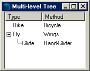
Tying the concepts presented in this section together allows us to present Example 3-11, which shows a multilevel tree with two columns and two top-level rows.
To create a new sublevel, create another <treechildren> element; inside of it, place a <treeitem>, which, in turn, contains one or more rows and cells. Figure 3-5 illustrates the result of this hierarchy.
3.4.2.4. Using trees in XUL templates
XUL templates are special built-in structures that allow dynamic updating of XUL elements and that are often used with trees and list boxes. Templates harness the power of the Resource Description Framework (RDF) to pull data from external datasources and dynamically create or update content in the UI. The following code extract shows the basic structure of a XUL template for displaying the browser history in Mozilla:
<template>
  <rule>
    <treechildren>
      <treeitem uri="rdf:*" rdf:type="rdf:http://www.w3.org/1999/02/22-rdf-syntax-
            ns#type">
        <treerow>
          <treecell label="rdf:http://home.netscape.com/NC-rdf#Name"/>
          <treecell label="rdf:http://home.netscape.com/NC-rdf#URL"/>
          <treecell label="rdf:http://home.netscape.com/NC-rdf#Date"/>
          <!-- further cells -->
        </treerow>
      </treeitem>
    </treechildren>
  </rule>
</template>
For each entry or row in the browser history, the template extracts information from the datasource and renders it in a treecell. It then updates it each time a page is visited. For a more detailed discussion, refer to Chapter 9.
3.4.2.5. Custom tree views
Custom views extend upon the static presentation of data in a tree with more flexibility, different ways to present the same data, and interfaces for defining behavior related to content. The functions include intercepting a treeitem selection and carrying out some functionality, populating or getting values from the tree, and returning the number of rows currently in the tree.
The first thing you have to do to build a custom view is instantiate your tree and then associate a view object with it, commonly known as a view.
document.getElementById('main-tree').treeBoxObject.view=mainView;In this example, the view that is exposed in the nsITreeView XPCOM object is essentially the lifeline for the tree, supplying the data that populates the view. The view is assigned to the code object that contains all the functions available to it and your implementation of what you need to do when they are activated.
Here is a large subset of the functions available to the view object:
setTree(tree)
Called during initialization and used to connect the tree view to the front end. This connection ensures that the correct tree is associated with the view.
- getCellText (row,column)
Returns the text of a particular cell, or an empty string if there's just an image in it.
- rowCount
Set up the number of rows that you anticipate for your tree.
- cycleHeader(index)
Called when you click on the header of a particular column.
- toggleOpenState
Put code in here to be carried out when the view is expanded and collapsed.
- setCellText (row, colID, value)
Called when the contents of the cell have been edited.
- performAction (action)
An event from a set of commands can be invoked when you carry out a certain action on the outliner. The tree invokes this method when certain keys are pressed. For example, when the ENTER key is pressed, performAction calls with the "enter" string.
There are more local conveniences in the form of PerformActionOnRow and performActionOnCell.
- selectionChanged
Should be hooked up to the onselect handler of the <tree> element in the XUL content.
3.4.3. Grid
A <grid> is another XUL table structure, designed to be more flexible with the content it can hold than the other tabular widgets. Example 3-12 shows a two-column grid that holds text input boxes and labels for them.
In a grid, the number of columns needs to be defined and placed in a <columns> set. In Example 3-12, the first column holds the labels and the second contains the text boxes. These two columns are horizontal to each other and in rows for easy association. The flex is greater on the second column, allowing more space for the text input boxes. As with all examples in this chapter, you can see Example 3-12 in action by adding the XML processing instruction at the top and surrounding the grid in a basic window root element.