3.6. Form Controls
In the HTML world, the textbox is one of the most commonly used elements in a form control. While the XPFE toolkit has no concept of a form, it was originally designed to allow HTML in the UI when needed, but only on a limited scale. Although it's still possible to incorporate HTML when you use the correct namespace, the existence of XUL widgets such as the textbox, checkbox and radio group selector obviates the need for HTML elements.
3.6.1. Radio
Radio groups are useful UI controls that present the user with a choice of options in XUL. In HTML, radio choices are represented by the <INPUT> element with the type attribute set to the value of radio, all wrapped in a form element. Example 3-14 shows how to make radio group choices in XUL.
The options must be enclosed in the <radiogroup> element, and each one is represented by a <radio> element. The important attributes are the id on the <radiogroup> and the group attribute on the <radio> elements. These attributes have to be identical to ensure that only one option at a time can be chosen. The this keyword in JavaScript lets you access the selected item in a straightforward way. In this case, it sends the node to the script every time an option is selected.
3.6.2. Checkbox
A checkbox is a simpler widget that needn't be part of a selection group. It is often used to indicate if some functionality should be turned on or off, as shown in Figure 3-7.
<checkbox id="closeWindow"
    label="Close this window when download is complete"
    checked="true" />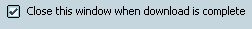
Clicking on the box sets the checked attribute, for which the check indicates a positive value. You can set this attribute in script to give the checkbox an initial value.
3.6.3. Buttons
A button is a multipurpose widget that commonly lives in toolbars and dialog boxes. The two button elements, <button> and <toolbarbutton>, are essentially the same. Often only the class attribute values distinguish the two. You can use a <toolbarbutton> outside a toolbar or use a <button> inside a toolbar, though in practice, the two usually stay in their respective domains. This flexibility has the nice effect of letting you get the buttons in a particular area by using the getElementsByTagName method with, for example, the tag name "button."
A common form of the button contains text and an image, with image on the left and the text to the right by default. However, you may want to take advantage of some of the classes available in Mozilla to define a different orientation, or you can simply write your own style rules for your buttons.[1] The text that appears on the button is contained in the label attribute and shown in this example:
<button id="newfileBtn"
    tooltiptext="New File"
    oncommand="doNew( )"
    label="New"/>
You can associate the image with the button using the src attribute, but the more common way is to use the list-style-image style rule in CSS, as in the following snippet of code that uses the id style selector:
#newfileBtn
{
    list-style-image:    url("chrome://editor/skin/images/newfile.gif");
}
3.6.3.1. Button types
Mozilla provides more than the standard "click" and "go" buttons in its toolkit. Table 3-3 describes the various button types in Mozilla.
Table 3-3. Button types
|
Type |
Usage |
Description |
|---|---|---|
|
Menu |
type= "menu" |
Menu integrated into the button with small arrow icon |
|
Dual Menu |
type= "menu-button" |
Menu appears distinct from the button, in separate clickable area |
|
Checkbox |
type= "checkbox" |
When selected, remains in a depressed state and toggles back to its natural state when selected again |
|
Radio |
type= "radio" |
Designed to be part of a group; only one button is selectable at a time |
|
Disclosure |
dlgtype= "disclosure" |
Shows/Hides a portion of a dialog window |
|
Default |
dlgtype= "accept" |
Performs the default action for a dialog |
|
Cancel |
dlgtype= "cancel" |
Closes the dialog and does not carry out the default action |
|
Help |
dlgtype= "help" |
Activates context-sensitive help |
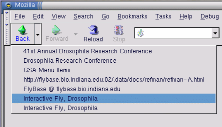
Taking one of the button types in Table 3-3 as a mini-case study, you could use a button with the type menu-button to display more than one option at a time. The default orientation for this type of button is for the menu to be to the right of the button. Mozilla uses buttons of type menu-button for its back and forward buttons, in which the menu items hold previously visited pages. Figure 3-8 shows the appearance of the browser's back button displaying the last several pages viewed.
Other possible uses include options for different variations of the same feature, such as a New button that displays New File, New Project, or New Template options. The button action is the default option and the menuitems contain the rest of the choices.
3.6.3.2. Dialog buttons
The last four items in Table 3-3 are button types that make most sense in, and were designed especially for, dialog windows. The easiest way to include them in dialogs is to use the buttons attribute on the <dialog> element, which displays them automatically, as shown here:
<dialog
  xmlns="http://www.mozilla.org/keymaster/gatekeeper/there.is.only.xul"
    buttons="accept,cancel,help"
    buttonpack="center"
    ondialogaccept="return onAccept( );"
    ondialogcancel="return onCancel( );"
    ondialoghelp="return doHelpButton( );">
The functions activated when these buttons are clicked on are defined in the ondialogaccept, ondialogcancel, and ondialoghelp event handler attributes. These event handler shortcuts are best if you simply want to inherit the default button text (Ok, Cancel, and Help). In cases when you want your own text, or want some extra control over the scripting, you can define your own button with the dlgtype attribute:
<button dlgtype="accept"
    label="Go For It!"
    oncommand="doExtraFunction( )"/>
The buttonpack attribute determines whether the buttons appear on the right, left, or center of the window. If no value is given, the default platform orientation takes effect. On Windows, the default is the right, and on Unix, it's the center.