 | Cascading Style Sheets: The Definitive Guide |  |

Basic Element Boxes
Margins or Padding?
Margins
Borders
Padding
Floating and Clearing
Lists
Summary
Most web designers are familiar with the limitations of HTML as a page layout language, even if they're not quite aware of it. Think about your page designs for a moment. How many of them depend on tables to get everything where it's supposed to go? If you're like the vast majority of web designers, all of your pages use tables. This is because tables can be used to create sidebars, of course, and to set up a complicated structure for an entire page's appearance, but also to do simpler things, like put text in a colored box with a border.
On the face of it, though, this latter effect is a little simple to be requiring a table. If all that's needed is a paragraph that has a red border and a yellow background, why should you have to wrap a single-cell table around the paragraph just to get that effect? Wouldn't it be much easier to simply say that the paragraph itself should have the border and background, and forget about all that table markup?
Thankfully, the authors of CSS felt the same way, so they devoted a great deal of attention to including the ability to define borders for darned near everything a web page can contain. Paragraphs, headings, DIVs, anchors, images, and more can be assigned borders of various types. These borders can be used to set an element apart from others, or accentuate its appearance, or to mark certain kinds of data as having been changed, or to do any number of other things.
In addition to borders, it's also possible to define regions around an element that control how the border is placed in relation to the content and how close other elements can get. Between the content of an element and its border, we find the padding of an element, and beyond the border, the margins. These properties affect how the entire document is laid out, of course, but more importantly, they very deeply affect the appearance of a given element. This is the foundation of much of the formatting model of CSS, and in order to understand it, we need to examine how an element is constructed.
Thanks to CSS, all document elements generate a rectangular box. This is called the element box. This box describes the amount of space that an element and its properties occupy in the layout of the document, and each box can therefore influence the position and size of other element boxes. For example, if the first element box in the document is an inch tall, then the next box will begin an inch below the top of the document. If the first element box is somehow altered in such a way as to make it be two inches tall, then every following element box will be shifted downward two inches, and the second element box will begin two inches below the top of the document.
As we can infer from Figure 7-1, the entirety of an HTML document is composed of a number of rectangular boxes that are distributed such that they don't overlap each other. Also, within certain constraints, these boxes take up as little space as possible, while still maintaining a sufficient separation to make clear which content belongs to which element.

For the first time, however, it is possible for authors to influence the separation between text elements in a fundamental way -- even to the point of causing elements to overlap each other! The margins and padding of the element boxes are the keys to this new power.
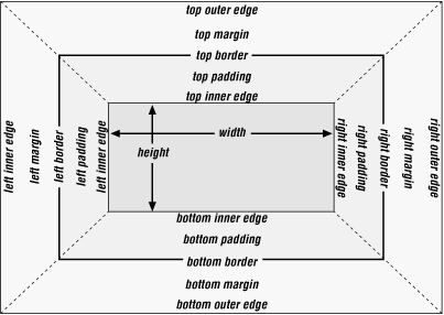
In order to fully understand how margins, padding, and borders are handled, you must clearly understand a number of boundaries and areas. They are shown in detail in Figure 7-2.

In general, the width of an element is defined to be the distance from the left inner edge to the right inner edge, and the height is the distance from the inner top to the inner bottom. Not coincidentally, these are both properties that can be applied to an element.
width
- Values
<length> | <percentage> | auto
- Initial value
auto
- Inherited
no
- Applies to
block-level and replaced elements
WARNING
Percentage values refer to the width of the parent element.
The counterpart to width is height.
height
- Values
<length> | auto
- Initial value
auto
- Inherited
no
- Applies to
block-level and replaced elements
In the course of this chapter, we will make two assumptions about width and height. The first is that the height of an element is always calculated automatically. If an element is eight lines long, and each line is an eighth of an inch tall, then the height of the element is one inch. If it's 10 lines tall, then the height is 1.25 inches; in either case, the height is determined by the content of the element, not the author. In the next chapter, we'll see that this need not be so, but for this chapter, we assume that height is only determined by the way an element is displayed.
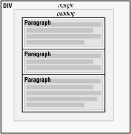
The second assumption is that the width of an element is just as wide as it needs to be. Under CSS, all element boxes are as wide as the content area of their parent element. Thus, if the content area of a DIV is two inches wide, then the overall element box of any paragraph within that DIV will be two inches wide as well. Figure 7-3 shows this in more detail.

Under many circumstances, the width of the margins, padding, and border of an element will all total zero, so the width of the element equals the content area of its parent. If there are margins or padding, for example, these are added to the element's width in order to equal the width of the parent element's content area. In any case, in this chapter, we always assume that the width of the element is as wide as it needs to be to equal its parent's content width.

Copyright © 2002 O'Reilly & Associates. All rights reserved.