 | Information Architecture for the World Wide Web |  |

In web sites, labels come in two formats, textual and iconic. We typically find them used in two ways: as links to chunks of information on other pages (usually within the context of navigation systems, as index terms, or as labels for links), and as headings that break up and identify the chunks of information on the same page (much like the heading on this printed page). Of course, a single label can do double duty; for example, the link Contact Us could lead to a page that uses the title label Contact Us.
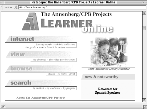
Navigation system labels demand consistent application more than any other type of labeling system. Navigation systems, as we described in Chapter 4, "Designing Navigation Systems", occur again and again within a web site. Just as users rely on navigational systems to be positioned on a page consistently and look the same throughout the site, they rely on their labels to work in a consistent, familiar way, as in Figure 5-1. Effectively applied labels are integral to building this sense of familiarity, so they'd better not change from page to page. That's why using the label Main, on one page, Main Page on another, and Home elsewhere will surely destroy the familiarity that the user needs when navigating a site.
Some conventions have emerged for navigation system labels. You should consider using these, as they are already familiar to most web users. Here is a non-exhaustive list:
Main, Main Page, Home, Home Page
Search, Find, Browse, Search/Browse, Site Map, Contents, Table of Contents, Index
Contact , Contact Us, Contact Webmaster, Feedback
Help, FAQ, Frequently Asked Questions
News, What's New
About, About Us, About <company name>, Who We Are
However, each example has two or more textual variants used to represent the same information. So these conventions aren't completely conventional; use them with care! At least use them consistently within your site, as in the example in Figure 5-1.
Conversely, the same label can often represent different kinds of information. For example, in one site News may link to an area in a site that includes announcements of new additions to the site. In another site News may link to an area of news stories describing national and world events. Obviously, if you use the same labels in different ways within your own site, your users will be very confused.
To address both problems, navigational labels can be augmented by brief descriptions (also known as scope notes) when initially introduced. For example, when a user first encounters these navigational labels on a site's main page, he or she will get a sense of their meaning from their accompanying descriptions:
|
Label |
Scope Note |
|---|---|
|
Search/Browse |
Search this site by entering a query, or browse it via a comprehensive site map. |
|
Contact Us |
A direct line to our customer service department, with a 24-hour turn-around guaranteed. |
|
News |
Keep current with our up-to-the-minute stock prices and press releases. |
|
Help |
Our site's FAQ, and how to contact our webmaster. |
After this initial introduction, the user should easily understand how to use the following navigation bar that appears on all the other pages in the site:
Search/Browse | Contact Us | News | Help
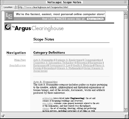
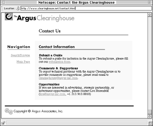
The labels are now familiar, and if used consistently, will work effectively. Usability tests run on many major sites have confirmed the contextual value of providing descriptions.[12] The Argus Clearinghouse provides a more extensive example of the use of scope notes (Figure 5-2).
[12]Jared Spool et al., Web Site Usability: A Designer's Guide. (Andover, MA: User Interface Engineering, 1997.)
Labels are increasingly used as indexing terms for classifying the contents of large sites. They work in two ways: enhancing a document's chance of getting retrieved by a searching system, and supporting browsing within a site.
To support searching, keywords are assigned to a document, whether within the <META> tag or in an accompanying database record that describes the document's contents. These labels are usually heard but not seen; in other words, they aren't necessarily visible to the user, but instead work in the background to ensure a search engine appropriately indexes the document. For example, we inserted the following code in the main page for International Furniture Rentals (http://www.rent-ifr.com):
<META name="keywords" content="IFR Furniture Rentals, International
Furniture Rentals, IFR Rentals, relocation, furniture rental, furniture
leasing, interim housing, furnished apartments, executive suites,
residential furniture, office furniture">
These indexing terms are keywords that describe the company's services and locations, as well as synonyms and name variants (e.g., IFR Rentals) that we anticipated might be searched by users. Search engines, whether Web-wide (e.g., Alta Vista, Hotbot) or specific to this site would then include these terms in their indexes, thereby improving user searching.
Indexing labels effectively within a page's <TITLE> tags can similarly improve a searcher's chances of retrieving the right pages in your site. In fact, we've found that Web-wide search engine relevance ranking algorithms seem to consider terms in a document's <TITLE> as very indicative of the document's content, and so these documents often end up ranked quite highly on result lists. In our own site, we included these descriptive labels within the <TITLE> tags:
<TITLE>Argus Associates. information architecture design, organization,
labeling, navigation, searching, indexing, intranets, Web sites</TITLE>
It's surprising that labels as indexing terms are not used more. Site sponsors do crazy things to get their sites noticed, including advertising their URL on banners flown over football stadiums, but they don't always bother to insert accurate, descriptive terms in their site's pages.
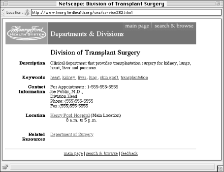
Besides enhancing searching, index labels can also improve browsing. By using keywords to manually index a site's content, you can provide additional means for accessing its content beyond its main organization scheme. For example, the Henry Ford Health System's site (shown in Figure 5-3) contains many records for each department, division, hospital, program, and so on. Because those are the major entities of the health system, they constitute the main organization system for that content. However, we also added topical keywords to each record (e.g., heart, kidney, liver, lung, skin graft, and transplantation) to allow users to access the site's content by topic. This approach allows users to cut across the grain of the site's main organization system and browse the content in a completely different mode.
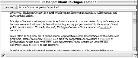
Labels are also used as textual links within the body or text of a chunk of information. These aren't as difficult to create because, unlike navigation system labels, they are naturally used in the descriptive context of their surrounding text. See Figure 5-4 for an example of link labels.
Just because they're relatively easy to create doesn't mean they necessarily work well. For example, take the following list of link labels:
Amalgamated
annual report
Bob Pobjoy
ButtMaster 5000
forty percent
Here, we have no clue what these labels mean because there is no context. Without context, these aren't part of a system at all. Certainly, if they were being used as part of a navigation system, they'd never work.
However, as we see these labels as links within the context of the text, they start to make sense:
...Amalgamated employees believe in the products that they manufacture, market, and sell. For example, forty percent of the company's employees religiously work out on Amalgamated's ButtMaster 5000 at least once per work day. According to Bob Pobjoy , Amalgamated's Chief Morale Officer, "It's a great stress reducer, healthful, and good clean fun. And if you read our annual report , you'll know that Amalgamated is firmly behind firm behinds" quips Pobjoy....
Systematic consistency isn't an issue for link labels. These labels are glued together by the copy, not by a particular system. However, consistency does become an issue between these labels and the chunks of information they link to.
For example, the link "annual report" may take the user to a page with the heading Financial Information. Most users won't have a problem with this, but at least a few will be confused. But if the link "Amalgamated" leads to a page labeled Acme Corporation, most users won't bother reading the copy far enough to learn that Amalgamated is really a division of Acme.
Avoiding the problems associated with inconsistencies between link labels and where they lead is difficult. We'll never be certain, for example, what we get if we select the link "Bob Pobjoy." A biography? A photo? A personal home page? A mailto:? An entry in a corporate directory? Will "forty percent" lead to a simple pie chart, or the results of a rigorous scientific study of Amalgamated employee exercise habits? These problems can be minimized by asking yourself, "What kind of information will the user expect to be taken to?" before creating and labeling a link. Then, apply your answer consistently. For example, consider having all references to personal names (e.g., Bob Pobjoy) lead to the same sort of destination (e.g., always to a mailto: link).
A note of caution about link labels: links embedded in text can be difficult for the eye to scan. They are fine for ad hoc links that cannot be easily separated from surrounding text, but don't rely on them for frequently used links such as navigational links.
Links are often used as headings that describe the chunk of information that follows the heading. For example, the label for this part of the page you are reading, "Labels as Headings," represents the chunk of information between it and the next heading, "Iconic Labeling Systems." To some degree, a heading label, like a link label, also relies on the text that follows to convey its meaning (see Figure 5-5). However, unlike link labels, there is no guarantee that the user will read the associated chunk of text. So there is extreme pressure on heading labels to draw the user's attention to the accompanying chunk of information.
To ensure that your heading labels work well as a system, display the heading labels from each page in your site as a single outline. Look for two characteristics: consistency in terminology and consistency in granularity. Consistent terminology means that the wording used among labels is uniform and cohesive. Consistent granularity means two things: 1) that the chunks of information represented at each level of labels are roughly of equal importance, and 2) that the levels of labels don't vary greatly in how deeply they cover parts of a site.
In the following example, we see the outlines for a site's main page and two of its component pages:
GPSC: Global Psychic Services Corporation
    Call our Telephone Hotline
    GPSC Publications for Sale
    For Prospective Employees
    Search This Site
Questions/FeedbackGPSC Publications for Sale: The Bon Vivant's Guide to Nouvelle Psychic Cooking
What is "Psychic Cooking"?
Synopsis
About the Author
What People are Saying About The Bon Vivant's Guide to Nouvelle Psychic
Cooking
Testimonials
Reviews
Ordering Information
By Fax
By Telephone
Via the InternetPublications for Sale-"Your Psychic Pet" How to Order This Book
The main page's problems with consistent terminology are due to a poor organization system. These labels are a mix of tasks (e.g., Call our Telephone Hotline, Search This Site), audiences (e.g., For Prospective Employees), and general topics (e.g., GPSC Publications for Sale, Questions/Feedback). Because the organization system is poorly designed, the labels that represent it are confusing.
The two GPSC Publications for Sale pages have inconsistent labels for the main heading and the ordering information:
GPSC Publications for Sale: The Bon Vivant's Guide to Nouvelle Psychic Cooking vs. Publications for Sale-"Living with Psychic Pets"
Ordering Information vs. How to Order This Book
One echoes the original heading on the main page, while the other omits the GPSC. One uses a colon, the other a dash to separate the generic label from the publication's title. One uses italics, while the other encloses the title in quotation marks. Also, these two pages have radically different sets of headings for no particularly good reason. Mightn't users also want a synopsis and author information for Your Psychic Pet?
Lastly, the first publication's page goes into much more detail than the second. The first has a much finer level of granularity than does the second. For example, on Page #1, there are heading labels for ordering By Fax, By Telephone, and Via the Internet, but on Page #2 the granularity is coarser: we only know How to Order This Book without mention of how it can be ordered. Is there any good reason for this? This sort of problem is caused by carelessness or, in other words, lack of planning.
It's true that a picture is worth a thousand words. But which thousand?
Icons can represent information in much the same way as text. We see them frequently used as navigation labels. Additionally, icons occasionally serve as heading labels and have even been known to show up as link labels, although this is rare.
The problem with iconic labels is that they constitute a much more limited language than text. Consider the concept home page. You'll find that there are icons that are commonly recognized as representing home pages. Here are a few examples:[13]
[13]These icons come from IconBAZAAR (http://www.iconbazaar.com/).
![]()
![]()
![]()
But what about when you want to represent something more complex? Like, for instance, a link to Press Releases? You may have occasionally seen a newspaper or cascaded trio of icons, like these:
![]()
![]()
![]()
Does it work? Would you automatically know that these icons represent press releases? Or would you have guessed that it represents a report? Or something that's already in print? Or something else altogether?
English has over 610,000 words.[14] Remarkably, English speakers have generally agreed to certain conventions about its syntax and semantics. In other words, there isn't much doubt what is meant by the textual label Main Page.
[14]According to Nettie Lagace, Reference Librarian at the Internet Public Library (http://www.ipl.org), "If you take the Oxford English Dictionary as gospel, (English) contains half a million words in the CD-ROM edition (http://www.oup-usa.org/oed/oed2cdfaq.html) according to its own homepage, but 616,500 words according to Harvard's link (http://hplus.harvard.edu/descriptions/oed.html ). The Encyclopedia Britannica says Webster's Third New International Dictionary of the English Language (1961), another authoritative unabridged source, contains `more than 450,000' words, but in its entry for `English Language' doesn't address the size of our collective vocabulary." Thanks Nettie!
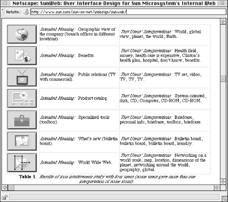
Iconic languages, however, are a bit more constrained. Because we're not all artistic, it's harder to convey a concept visually than it is in text (see Figure 5-6). For example, if I drew an image of a house for use as a main page icon, it's as likely that you'd interpret my drawing as representing a home page as you'd interpret it as a dog chasing its tail.
Even more than text labels, iconic labels rely on consistent positioning on a site's pages. Moving them around from page to page can sacrifice the user's ability to scan the page quickly and understand what the labels represent, thereby negating much of the benefit of using iconic labels.
Icons are fine for representing a few key concepts in a web site. We've all seen a few conventions, such as a house icon for a main page, a question mark for a help page, a magnifying glass for a search page, and so forth. But there aren't too many more that conform to convention, so using icons to represent a large, complex site is an approach that won't scale well. How large is the language of standard web icons? A dozen, perhaps? Certainly no comparison to its textual counterpart, English. In fact, you'll notice that very few web sites bother to use iconic labels without accompanying textual labels, if they use icons at all.
So why use iconic labels, especially if you can't use them without textual labels? Two reasons: 1) they can contribute to a consistent, attractive graphic identity for a site, and 2) they are familiar and easy for the user to find on a page (if they are drawn from the small group of concepts conventionally understood and are used consistently on all the site's pages).

Copyright © 2002 O'Reilly & Associates. All rights reserved.