Chapter 4. Animation
| If you know HTML, CSS, and JavaScript, you already have the tools you need to develop Android applications. This hands-on book shows you how to use these open source web standards to design and build apps that can be adapted for any Android device -- without having to use Java. Buy the print book or ebook or purchase it in iBooks. |
Android apps have a number of distinctive animation characteristics that add context and meaning for the user. For example, pages slide left as you drill down through links, and slide right as you navigate back. In this chapter, you’ll learn how to add characteristic behaviors like sliding, page flip, and more to your web app. These changes will make your web app almost indistinguishable from a native application.
With a Little Help from Our Friend
I’ll be honest: making a web page animate like a typical native app is hard. Fortunately, an enterprising young lad named David Kaneda has created a JavaScript library called jQTouch that makes mobile web development a whole heckuva lot easier. jQTouch is an open source jQuery plugin that handles virtually everything we learned in the previous chapter, as well as a boatload of much more complex stuff that would be truely painful to write from scratch.
Note
You can download the latest version of jQTouch from http://jqtouch.com/.
Note
In the interest of full disclosure, you should know David recently asked me to be the official maintainer for jQTouch – an honor I happily accepted.
Sliding Home
We are going to build a simple calorie tracking application called Kilo that allows the user to add and delete food entries for a given date. All told, there will be five panels: Home, Settings, Dates, Date, and New Entry. We’ll start off with two panels and work our way up as we go.
Note
I’ll be assigning CSS classes to some of the HTML elements (e.g. toolbar, edgetoedge, arrow, button, back, etc.). In every case, these classes correspond to predefined CSS class selectors that exist in the default jQTouch theme. Bear in mind that you can create and use your own classes by modifying existing jQTouch themes or creating your own from scratch; I’m just using the defaults.
We’re going to start from scratch here, so you can put aside the files you created in the preceding chapters. To begin, let’s create a file named index.html and add the following HTML for the Home and About panels (see Example 4.1, “HTML for the Home and About panels in index.html.”)
Example 4.1. HTML for the Home and About panels in index.html.
<html>
    <head>
        <title>Kilo</title>
    </head>
    <body>
        <div id="home">
            <div class="toolbar">
                <h1>Kilo</h1>
            </div>
            <ul class="edgetoedge">
                <li class="arrow"><a href="#about">About</a></li>
            </ul>
        </div>
        <div id="about">
            <div class="toolbar">
                <h1>About</h1>
                <a class="button back" href="#">Back</a>
            </div>
            <div>
                <p>Kilo gives you easy access to your food diary.</p>
            </div>
        </div>
    </body>
</html>
</div>
<div>
<p>Kilo gives you easy access to your food diary.</p>
</div>
</div>
</body>
</html>The HTML here basically amounts to a head with a title, and a body with two children, both divs:
This | |
Inside each panel | |
This unordered list tag has the class | |
On this line there is an | |
The toolbar elements each contain a single NoteNote that the href on the Back button is set to |
With the basic HTML in place, it’s time to add jQTouch to the party. Once you’ve downloaded jQTouch and unzipped it in the same directory as the HTML document, you just add a few lines of code to the head of your page (Example 4.2, “Adding these lines to the head of your document will activate jQTouch.”).
Note
For this and other examples in this book, you will need to download jQTouch from http://www.jqtouch.com, unzip it, and move the jqtouch and themes directories into the same directory as your HTML document. You will also need to go into the jqtouch directory and rename the jQuery JavaScript file (such as jquery.1.3.2.min.js) to jquery.js.
Example 4.2. Adding these lines to the head of your document will activate jQTouch.
<link type="text/css" rel="stylesheet" media="screen" href="jqtouch/jqtouch.css"><link type="text/css" rel="stylesheet" media="screen" href="themes/jqt/theme.css">
<script type="text/javascript" src="jqtouch/jquery.js"></script>
<script type="text/javascript" src="jqtouch/jqtouch.js"></script>
<script type="text/javascript">
var jQT = $.jQTouch({ icon: 'kilo.png' }); </script>
I’m including the | |
I’m including the CSS for my selected theme, in this case, the “jqt” theme, which comes with jQTouch. The classes that I’ve been using in the HTML correspond to CSS selectors in this document. jQTouch comes with two themes available by default. You can also make your own by duplicating a default theme and making changes to it, or writing a new one from scratch. | |
jQTouch requires jQuery, so I include that here. jQTouch comes with its own copy of jQuery (which you need to rename to | |
This is where I include jQTouch itself. Note that you have to include jQTouch after jQuery or nothin’ ain’t gone work. | |
This brings us to the script block where I initialize the jQTouch object and send in a property value: jQTouch exposes several properties that allow you to customize the behavior and appearance of your app. You’ll see several throughout the course of this book, and they are all optional. However, you’ll pretty much always be using at least a few of them. In this case, |
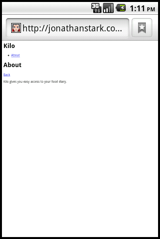
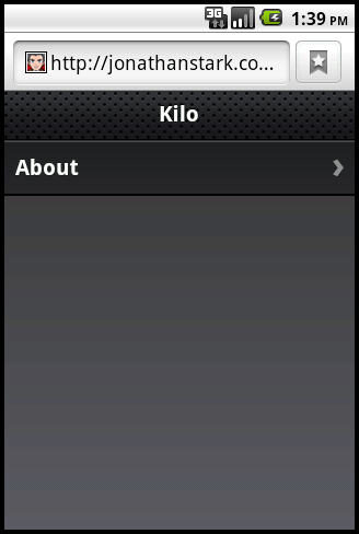
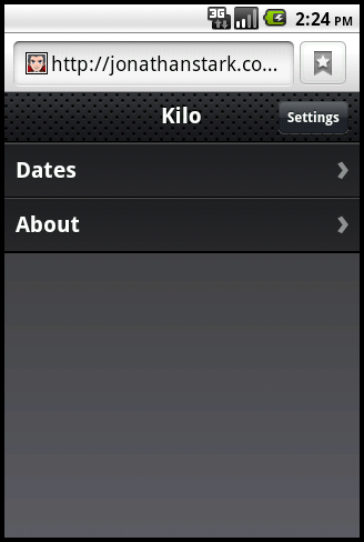
The difference between the application before jQTouch (Figure 4.1, “Kilo before jQTouch...”) and after (Figure 4.2, “...and Kilo after jQTouch.”) is dramatic, but the truly astonishing change is that you’ve just added gorgeous left/right sliding to your app with 10 lines of code. jQTouch is awesome, and we're just getting started.
Adding the Dates Panel
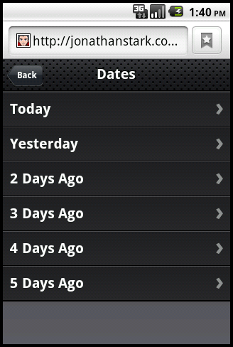
Let’s add the Dates panel. The Dates panel will have a list of relative dates beginning with Today and going back to 5 days ago (Figure 4.3, “The Dates panel consists of a toolbar with a back button and a clickable list of relative dates.”). Add the HTML for the Dates panel (shown in Example 4.3, “The HTML for the Dates panel.”) right after the About panel, just before the closing </body> (in a moment, I'll show you how to add a link to this from the Home panel).
Example 4.3. The HTML for the Dates panel.
<div id="dates">
<div class="toolbar">
<h1>Dates</h1>
<a class="button back" href="#">Back</a>
</div>
<ul class="edgetoedge">
<li class="arrow"><a id="0" href="#date">Today</a></li>
<li class="arrow"><a id="1" href="#date">Yesterday</a></li>
<li class="arrow"><a id="2" href="#date">2 Days Ago</a></li>
<li class="arrow"><a id="3" href="#date">3 Days Ago</a></li>
<li class="arrow"><a id="4" href="#date">4 Days Ago</a></li>
<li class="arrow"><a id="5" href="#date">5 Days Ago</a></li>
</ul>
</div>
Figure 4.3. The Dates panel consists of a toolbar with a back button and a clickable list of relative dates.
Like the About panel, the Dates panel has a toolbar with a title and back button. After the toolbar, there is an unordered edgetoedge list of links. Notice that all of the links have unique ids (i.e. 0 through 5) but the same href (i.e. #date)—more on that in a bit.
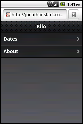
Next, you have to update the Home panel with a link to the Dates panel. Add the line shown in bold to the Home panel in index.html:
<div id="home">
<div class="toolbar">
<h1>Kilo</h1>
</div>
<ul class="edgetoedge">
<li class="arrow"><a href="#dates">Dates</a></li>
<li class="arrow"><a href="#about">About</a></li>
</ul>
</div>And just like that, we’ve added a new panel to the app. Clicking on an item on the Dates panel doesn’t do anything yet. Let’s rectify that situation by adding a panel to display a date item (the Date panel).
Adding the Date Panel
The Date panel looks a lot like the previous panels, with a couple of exceptions (refer to Example 4.4, “The HTML for the Date panel.”). Add the HTML for the Date panel right after the Dates panel, just before the closing </body>.
Example 4.4. The HTML for the Date panel.
<div id="date">
<div class="toolbar">
<h1>Date</h1>
<a class="button back" href="#">Back</a>
<a class="button slideup" href="#createEntry">+</a> </div>
<ul class="edgetoedge">
<li id="entryTemplate" class="entry" style="display:none">
 <span class="label">Label</span>
<span class="calories">000</span>
<span class="delete">Delete</span>
</li>
</ul>
</div>
<span class="label">Label</span>
<span class="calories">000</span>
<span class="delete">Delete</span>
</li>
</ul>
</div>The Date panel toolbar has an additional button. When clicked, this button will display the New Entry panel (which we have not yet built). I’ve given the link a class of | |
The other unusual aspect of this panel is that I’ve defined a list item with the style set to As you’ll see in a bit, I’m going to use this invisible list item as a template to display entries once they are created. At this point, there are no entries, so the panel will be empty aside from the toolbar. |
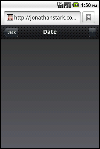
Now that you've added the Date panel, clicking any item on the Dates panel will slide the empty Date panel (Figure 4.5, “Other than the toolbar, the Date panel is empty to begin with.”) into view.
Adding the New Entry Panel
Example 4.5, “The HTML for the New Entry Panel.” shows the source code for the New Entry panel. Add this code to the end of index.html, but before the closing </body>:
Example 4.5. The HTML for the New Entry Panel.
<div id="createEntry">
<div class="toolbar">
<h1>New Entry</h1>
<a class="button cancel" href="#">Cancel</a> </div>
<form method="post">
 <ul class="rounded">
<li><input type="text" placeholder="Food" name="food" id="food"
autocapitalize="off" autocorrect="off" autocomplete="off" /></li>
<li><input type="text" placeholder="Calories" name="calories" id="calories"
autocapitalize="off" autocorrect="off" autocomplete="off" /></li>
<li><input type="submit" class="submit" name="action" value="Save Entry" /></li>
 </ul>
</form>
</div>
</ul>
</form>
</div>The first thing to point out about the New Entry panel is that rather than having a back button, it has a cancel button. NoteCancel buttons in jQTouch behave just like back buttons in that they remove the current page from view with the reverse animation that it came into view. However, cancel buttons are not shaped like a left arrow the way back buttons are. I used a cancel button for the New Entry panel because it slides up on the way in and will therefore slide down on the way out. It would be counterintuitive to click a left pointing back button and then have the panel slide down. | |
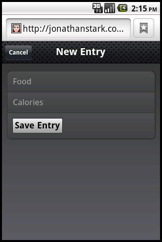
This HTML form contains an unordered (bulleted) list of three items: two text fields and a submit button. Embedding form controls in an Each of the text inputs has quite a few attributes defined that I’ll describe individually:
| |
The |
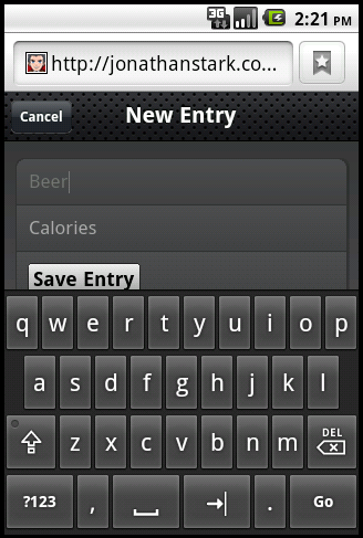
Figure 4.7, “Keyboard data entry with the New Entry form.” shows the New Entry form in action. At this point, I’ve done nothing to actually save the entry when the user clicks Save Entry. We’ll cover that in Chapter 5, Client-Side Data Storage.
Adding the Settings Panel
We haven’t yet created a button that will allow users to navigate to a settings panel, so let’s add one to the toolbar on the Home panel. All it takes is a single line of HTML, shown in bold:
<div id="home">
<div class="toolbar">
<h1>Kilo</h1>
<a class="button flip" href="#settings">Settings</a> </div>
<ul class="edgetoedge">
<li class="arrow"><a href="#dates">Dates</a></li>
<li class="arrow"><a href="#about">About</a></li>
</ul>
</div>
... remaining HTML not shown ...
</div>
<ul class="edgetoedge">
<li class="arrow"><a href="#dates">Dates</a></li>
<li class="arrow"><a href="#about">About</a></li>
</ul>
</div>
... remaining HTML not shown ...
This is the line of HTML that adds the button. Notice that I’ve assigned the NoteUnfortunately, support for 3D animations is spotty across mobile platforms, including Android. Therefore flip, swap, cube and any other 3D animations will fail over to 2D animations when 3D is not supported. |
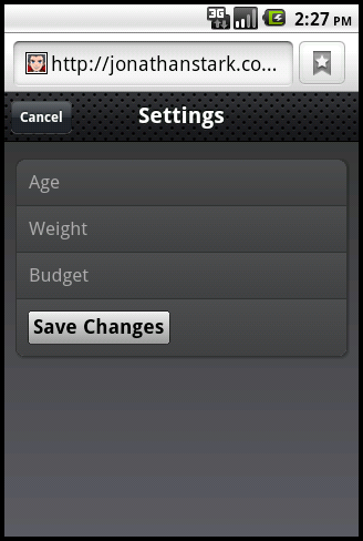
After working on the New Entry panel, the HTML for the Settings panel is going to look pretty similar (Example 4.6, “The HTML for the Settings Panel”). There is one more text input and some of the attributes have been omitted or have different values, but conceptually they are identical. Add this to your HTML document just as you've done with the HTML for the other panels.
As with the New Entry form, the Settings form does not currently save any of the information associated with it. Its submission handler will be described in the next chapter.
Example 4.6. The HTML for the Settings Panel
<div id="settings">
<div class="toolbar">
<h1>Settings</h1>
<a class="button cancel" href="#">Cancel</a>
</div>
<form method="post">
<ul class="rounded">
<li><input placeholder="Age" type="text" name="age" id="age" /></li>
<li><input placeholder="Weight" type="text" name="weight" id="weight" /></li>
<li><input placeholder="Budget" type="text" name="budget" id="budget" /></li>
<li><input type="submit" class="submit" name="action" value="Save Changes" /></li>
</ul>
</form>
</div>
Putting It All Together
So, there you have it. With fewer than 100 lines of code, we’ve created a native-style UI for a five panel application complete with three different page transition animations. See Example 4.7, “The complete HTML listing for the five panel UI.” for a complete listing of the final HTML. Not too shabby, right?
Example 4.7. The complete HTML listing for the five panel UI.
<html>
<head>
<title>Kilo</title>
<link type="text/css" rel="stylesheet" media="screen" href="jqtouch/jqtouch.css">
<link type="text/css" rel="stylesheet" media="screen" href="themes/jqt/theme.css">
<script type="text/javascript" src="jqtouch/jquery.js"></script>
<script type="text/javascript" src="jqtouch/jqtouch.js"></script>
<script type="text/javascript">
    var jQT = $.jQTouch({
        icon: 'kilo.png'
    });
</script>
</head>
<body>
<div id="home">
<div class="toolbar">
<h1>Kilo</h1>
<a class="button flip" href="#settings">Settings</a>
</div>
<ul class="edgetoedge">
<li class="arrow"><a href="#dates">Dates</a></li>
<li class="arrow"><a href="#about">About</a></li>
</ul>
</div>
<div id="about">
<div class="toolbar">
<h1>About</h1>
<a class="button back" href="#">Back</a>
</div>
<div>
<p>Kilo gives you easy access to your food diary.</p>
</div>
</div>
<div id="dates">
    <div class="toolbar">
        <h1>Dates</h1>
        <a class="button back" href="#">Back</a>
    </div>
    <ul class="edgetoedge">
        <li class="arrow"><a id="0" href="#date">Today</a></li>
        <li class="arrow"><a id="1" href="#date">Yesterday</a></li>
        <li class="arrow"><a id="2" href="#date">2 Days Ago</a></li>
        <li class="arrow"><a id="3" href="#date">3 Days Ago</a></li>
        <li class="arrow"><a id="4" href="#date">4 Days Ago</a></li>
        <li class="arrow"><a id="5" href="#date">5 Days Ago</a></li>
    </ul>
</div>
<div id="date">
    <div class="toolbar">
        <h1>Date</h1>
        <a class="button back" href="#">Back</a>
        <a class="button slideup" href="#createEntry">+</a>
    </div>
    <ul class="edgetoedge">
        <li id="entryTemplate" class="entry" style="display:none">
            <span class="label">Label</span>
            <span class="calories">000</span>
            <span class="delete">Delete</span>
        </li>
    </ul>
</div>
<div id="createEntry">
    <div class="toolbar">
        <h1>New Entry</h1>
        <a class="button cancel" href="#">Cancel</a>
    </div>
    <form method="post">
        <ul class="rounded">
            <li><input type="text" placeholder="Food" name="food" id="food"
                 autocapitalize="off" autocorrect="off" autocomplete="off" /></li>
            <li><input type="text" placeholder="Calories" name="calories" id="calories"
                 autocapitalize="off" autocorrect="off" autocomplete="off" /></li>
            <li><input type="submit" class="submit" name="action" value="Save Entry" /></li>
        </ul>
    </form>
</div>
<div id="settings">
    <div class="toolbar">
        <h1>Settings</h1>
        <a class="button cancel" href="#">Cancel</a>
    </div>
    <form method="post">
        <ul class="rounded">
            <li><input placeholder="Age" type="text" name="age" id="age" /></li>
            <li><input placeholder="Weight" type="text" name="weight" id="weight" /></li>
            <li><input placeholder="Budget" type="text" name="budget" id="budget" /></li>
            <li><input type="submit" class="submit" name="action" value="Save Changes" /></li>
        </ul>
    </form>
</div>
</body>
</html>
Customizing jQTouch
jQTouch allows you to customize its default behavior by sending a variety of property settings into the constructor. You saw this previously with the icon and statusBar, but there are several others that you should be aware of.
Table 4.1. jQTouch Customization Options
| Property | Default | Expects | Notes |
|---|---|---|---|
| addGlossToIcon | true | true or false | If set to true, gloss will be added to the home screen icon on iPhone. Has no effect on Android. |
| backSelector | '.back, .cancel, .goback' | Any valid CSS selector. Separate multiple values with a comma. | Defines elements that will trigger the “back” behavior of jQTouch when tapped. When the back behavior is invoked, the current panel moves off screen with a reverse animation and is removed from history. |
| cacheGetRequests | true | true or false | If set to true, automatically caches GET requests, so subsequent clicks reference the already loaded data. |
| cubeSelector | '.cube' | Any valid CSS selector. Separate multiple values with a comma. | Defines elements that will trigger a cube animation from the current panel to the target panel. |
| dissolveSelector | '.dissolve' | Any valid CSS selector. Separate multiple values with a comma. | Defines elements that will trigger a dissolve animation from the current panel to the target panel. |
| fadeSelector | '.fade' | Any valid CSS selector. Separate multiple values with a comma. | Defines elements that will trigger a fade animation from the current panel to the target panel. |
| fixedViewport | true | true or false | If set to true, prevents users from being able to zoom in or out of the page. |
| flipSelector | '.flip' | Any valid CSS selector. Separate multiple values with a comma. | Defines elements that will trigger a flip animation from the current panel to the target panel. |
| formSelector | 'form' | Any valid CSS selector. Separate multiple values with a comma. | Defines elements that should receive the onsubmit handler. |
| fullScreen | true | true or false | iPhone only; has no effect on Android. When set to true, your app will open in full screen mode when launched from the users home screen. Has no effect on the display if the app is running in Mobile Safari. |
| fullScreenClass | 'fullscreen' | String | iPhone only; has no effect on Android. Class name that will be applied to the body when the app is launched in full screen mode. Allows you to write custom CSS that only executes in full screen mode. |
| icon | null | null or a relative or absolute path to a png image file. | The home screen icon for your app. This is the image that will be displayed when a user adds a bookmark for your app to their home screen. |
| popSelector | '.pop' | Any valid CSS selector. Separate multiple values with a comma. | Defines elements that will trigger a pop animation from the current panel to the target panel. |
| preloadImages | false | An array of image paths. | Defines images that will be loaded before the page loads. For example: ['images/link_over.png', 'images/link_select.png'] |
| slideInSelector | 'ul li a' | Any valid CSS selector. Separate multiple values with a comma. | Defines elements that will trigger a slide left animation from the current panel to the target panel. |
| slideupSelector | '.slideup' | Any valid CSS selector. Separate multiple values with a comma. | Defines elements that will cause the target panel to slide up into view in front of the current panel. |
| startupScreen | null | null or a relative or absolute path to an image file. | iPhone only; has no effect on Android. Pass a relative or absolute path to a 320px x 460px startup screen for full screen apps. Use a 320px x 480px image if you set statusBar to black-translucent. |
| statusBar | 'default' | default, black-translucent, black | iPhone only; has no effect on Android. Defines the appearance of the 20 pixel status bar at the top of the window in an app launched in full screen mode. |
| submitSelector | '.submit' | Any valid CSS selector. Separate multiple values with a comma. | Selector which, when clicked, will submit its parent form (and close keyboard if open). |
| swapSelector | '.swap' | Any valid CSS selector. Separate multiple values with a comma. | Defines elements that will cause the target panel to swap into view in front of the current panel. |
| useAnimations | true | true or false | Set to false to disable all animations. |
What You’ve Learned
In this chapter, you’ve learned how to add native looking animations to a web app using jQTouch. In the next chapter, you’ll learn how to use the new local storage and client-side database features of HTML5 to add persistent data storage to your app.

