 | Web Design in a Nutshell, 2nd Edition |  |

First, let it be stated that "layout techniques with HTML" is an oxymoron. HTML was specifically designed to pass off all layout functions to the end user's browsing tool. The controls over presentation listed here are the result of either extensions to the original HTML standard or a "creative use" (or misuse, depending who you ask) of an existing tag.
Several tags, such as <blockquote> or certain list tags, let you add text indents, while the <pre> tag gives you limited formatting control using "preformatted" text, and we'll look at these simple mechanisms here. HTML tables offer more precise control over positioning, which is covered in Chapter 13, "Tables".
Ideally, of course, presentation should be controlled using style sheets.
Preformatted (<pre>) text is unique in that it is displayed exactly as it is typed in the HTML source code -- including all line returns and multiple character spaces (in all other HTML text, returns and consecutive spaces are just ignored). Preformatted text is always displayed in a monospace font, which allows columns of characters to line up correctly.
The same block of source text was coded as <pre> text and as teletype (<tt>), another method for specifying a monospace font. The difference is obvious, as shown in Figures Figure 10-13 and Figure 10-14.
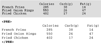
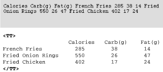
The <pre> tag is the only HTML tag that lets you know exactly how your text will line up when displayed in a browser. For this reason, it was adopted early on as a favorite cheat for controlling alignment in web pages. The downside is that all the text will be displayed in Courier.
Note that <pre> is a block element, meaning that it is always preceded and followed by a line break (some browsers also add extra space above and below the block). For this reason, it is not possible to set text within a paragraph as preformatted. If you need a number of blank spaces within a sentence, use nonbreaking space characters ( ) instead.
Text and graphics that appear within "no-break" (<nobr>) tags always display on one line, and are not wrapped in the browser window. If the string of characters or elements within <nobr> tags is very long, it continues off the browser window, and users must scroll horizontally to the right to see it, as shown in Figure 10-15.
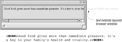
The <nobr> tag can be used to hold together a row of graphics, such as the buttons of a toolbar, so they always display as one piece.
Adding a <br> within <nobr> tagged text causes the line to break.
The word-break tag (<wbr> ) is an esoteric little tag that can be used in conjunction with the no-break tag. <wbr> is used to indicate a potential word break point within <nobr> tagged content. When the "no-break" segment extends beyond the browser window, the <wbr> tag tells it exactly where it is permitted to break the line, as shown in Figure 10-16. It keeps line lengths from getting totally out of hand.

It should be noted that both <nobr> and <wbr> are not part of the HTML 4.01 specification but are widely supported by popular browsers.
There are two methods for centering text elements horizontally on a page: the align attribute and the <center> tag. Bear in mind that the <center> tag and align attribute have been deprecated by the HTML 4.01 specification in favor of style sheet controls (although browsers will continue to support the following tags for a while).
One way to center elements is to use the block-level tags' align attribute with its value set to center. The align attribute can be added to the paragraph tag (<p>), any heading tag (<h1> through <h6>), or a page division (<div>). Be sure to close the tags at the end of the element.
In Figure 10-17, each element is centered individually using align=center.
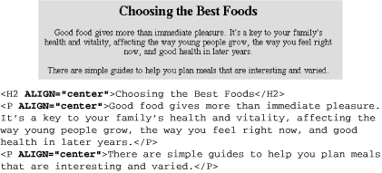
As an alternative, you could enclose all three elements in a <div> tag with align=center. Unfortunately, the align attribute in a <div> tag is only recognized by Internet Explorer Version 3.0 and higher and by Navigator Versions 4.0 and up, so it is not a universal solution. The following code creates the same effect shown in Figure 10-17:
<DIV ALIGN="center">
<H2>Choosing the Best Foods</H2>
<P>Good food gives more than immediate pleasure. It's a key to your
family's health and vitality, affecting the way young people grow, the
way you feel right now, and good health in later years.</P>
<P>There are simple guides to help you plan meals that are interesting
and varied.</P>
</DIV>
An extension to HTML, the <center> tag is extremely straightforward to use (and for that reason, it is used commonly) -- just place the <center> and </center> tags around sections of the page you would like to be centered, as shown in the following code. This works the same as <div align=center>, but it is better supported. The <center> tag has been deprecated in the HTML 4.01 specification.
You can place your whole page within <center> tags or apply it just to certain paragraphs. The <center> tag can only be applied to block-level elements since it is illogical to center text within the flow of left-aligned text.
<CENTER>
<H2>Choosing the Best Foods</H2>
<P>Good food gives more than immediate pleasure. It's a key to your
family's health and vitality, affecting the way young people grow, the
way you feel right now, and good health in later years.</P>
<P>There are simple guides to help you plan meals that are interesting
and varied.</P>
</CENTER>
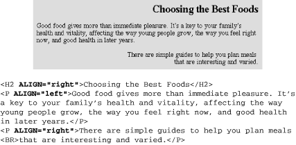
The align attribute is also used to specify left alignment and right alignment by setting its value to left or right, respectively. The alignment remains in effect until the browser encounters another alignment instruction in the source. You can break lines with the <br> tag within an aligned paragraph without losing the alignment. Figure 10-18 shows the effects of setting the attribute to left or right. Page elements are left-justified by default in left-to-right languages.
TIP
Text aligned with the align attribute overrides any centering set with the <center> tag.
Unfortunately , there is no specific function for creating indented text in HTML, so it has become common for web designers to make do with existing tags that have the side effect of producing an indent. This section looks at the more popular "cheats" for indenting text using only text-formatting tags.
Be aware, however, that it is poor HTML form to arbitrarily label elements just for their display features (like indenting). The recommended method is to use style sheets to specify margin indents (it's a much more precise method as well). You can also achieve indents using tables (see Chapter 13, "Tables"). Some designers place transparent graphics in the text to create white space, but this is strongly discouraged.
The following techniques are presented in the spirit of providing a thorough overview of current HTML solutions, and because you may also see them generated by WYSIWYG authoring tools. Their inclusion by no means represents an endorsement of the "old ways."
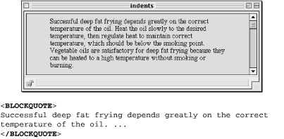
The blockquote element is intended to be used for lengthy quotations, but it has long been a favorite for adding white space along the left and right margins of a block of text. Browsers generally add approximately 40 pixels of space between the browser margin (not the window border) and the left and right edges of a blockquote element, as shown in Figure 10-19.
There are a few things you should know when using blockquotes. Some early browsers display blockquote material in italic, making it difficult to read on the screen. Also, if you plan to place aligned images in a blockquote, keep in mind that browsers are inconsistent in the way they display images within blockquotes. Some align the graphic with the indented blockquote margin; others align the image with the normal margin of paragraph text. It's a good idea to test on a variety of browsers.
Some web authors (and WYSIWYG authoring tools) take advantage of the automatic indentation that takes place when you specify text as a list. The two following methods are both syntactically incorrect and ought to be avoided, but they can be used in a pinch to create an indent from the left margin of the browser window. Either approach produces the result shown in Figure 10-20.
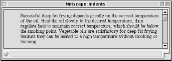
Marking a text element as an unordered list sets the text on a left-indent. As long as you don't add any list items (<li>) within the list, no bullets appear.
<UL>
Successful deep fat frying depends greatly on the correct
temperature of the oil. ...
</UL>
A definition (<dd>) within a definition list (<dl>) is also set with the standard left indent. It's fine to omit the term from the list. I've seen definition lists set within definition lists to create deeper levels of indent (it's not pretty, but it works).
<DL>
<DD>Successful deep fat frying depends greatly on the correct temperature of the oil. ...
</DD>
</DL>

Copyright © 2002 O'Reilly & Associates. All rights reserved.