Chapter 4. Animation
| If you know HTML, CSS, and JavaScript, you already have what you need to develop your own iPhone apps. With this book, you'll learn how to use these open source web technologies to design and build apps for both the iPhone and iPod Touch. Buy the print book or ebook or purchase the iPhone App. |

iPhone apps have a number of distinctive animation characteristics that add context and meaning for the user. For example, pages slide left as you drill down through links, and slide right as you navigate back. In this chapter, you’ll learn how to add characteristic behaviors like sliding, page flip, and more to your web app. These changes, in combination with Ajax and full screen mode, will make your web app almost indistinguishable from a native application.
With a Little Help from Our Friend
I’ll be honest: making a web page animate like a typical native iPhone app is hard. Fortunately, an enterprising young lad from Philly named David Kaneda has written a JavaScript library called jQTouch that makes mobile web development a whole lot easier. jQTouch is an open source jQuery plug-in that handles virtually everything we learned in the previous chapter, as well as a boatload of much more complex stuff that would be truly painful to write from scratch.
Note
You can download the latest version of jQTouch from http://jqtouch.com/.
Sliding Home
We are going to build a simple calorie-tracking application called Kilo that allows the user to add and delete food entries for a given date. All told, there will be five panels: Home, Settings, Dates, Date, and New Entry. We’ll start off with two panels and work our way up as we go.
Note
I’ll be assigning CSS classes to some of the HTML elements (toolbar,
edgetoedge, arrow, button,
back, etc.). In every case, these classes correspond to
predefined CSS class selectors that exist in the default jQTouch theme.
Bear in mind that you can create and use your own classes by modifying
existing jQTouch themes or building your own from scratch; I’m just using the
defaults.
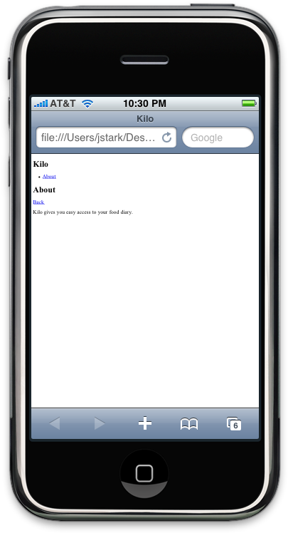
To begin, let’s create a file named
index.html and add the HTML shown in Example 4.1, “HTML for the Home and About panels in index.html” for the Home and About panels.
Figure 4.1. Kilo before jQTouch...
Example 4.1. HTML for the Home and About panels in index.html
<html>
<head>
<title>Kilo</title>
</head>
<body>
<div id="home"> <div class="toolbar">
 <h1>Kilo</h1>
</div>
<ul class="edgetoedge">
<h1>Kilo</h1>
</div>
<ul class="edgetoedge"> <li class="arrow"><a href="#about">About</a></li>
 </ul>
</div>
<div id="about">
<div class="toolbar">
<h1>About</h1>
<a class="button back" href="#">Back</a>
</ul>
</div>
<div id="about">
<div class="toolbar">
<h1>About</h1>
<a class="button back" href="#">Back</a> </div>
<div>
<p>Kilo gives you easy access to your food diary.</p>
</div>
</div>
</body>
</html>
</div>
<div>
<p>Kilo gives you easy access to your food diary.</p>
</div>
</div>
</body>
</html>The HTML here basically amounts to a head with
a title, and a body with two children, both divs:
| This |
| Inside each panel |
| This unordered list tag has the class
|
| On this line there is an |
| The toolbar elements each contain a single
|
Note
Note that the href on the
back button is set to #. Normally, this would tell the
browser to return to the top of the current document. But when using
jQTouch, it navigates back to the previous panel instead. In more
advanced scenarios, you might want to use a specific anchor, such as
#home, which would instruct the back button to navigate to
a particular panel regardless of what the previous panel was.
With the basic HTML in place, it’s time to add jQTouch to the party. Once you’ve downloaded jQTouch and unzipped it in the same directory as the HTML document, you just add a few lines of code to the head of your page (Example 4.2, “Adding these lines to the head of your document will activate jQTouch”).
Note
For this and other examples in this book, you
will need to download jQTouch from http://jqtouch.com, unzip it, and move the
jqtouch and themes directories
into the same directory as your HTML document. You will also need to go
into the jqtouch directory and rename the jQuery
JavaScript file (such as jquery.1.3.2.min.js) to
jquery.js.
Example 4.2. Adding these lines to the head of your document will activate jQTouch
<link type="text/css" rel="stylesheet" media="screen" href="jqtouch/jqtouch.css">
Note
By the way, jQTouch assumes that you want the
app to run in full screen mode because, hey...that’s how you roll. If
you’d prefer to disallow full screen mode, you can add fullScreen:
false to the property list.
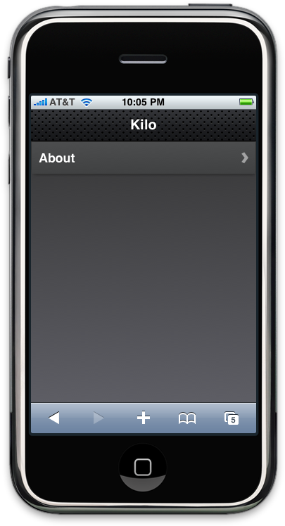
The difference between the application before jQTouch (Figure 4.1, “Kilo before jQTouch...”) and after (Figure 4.2, “...and Kilo after jQTouch”) is dramatic, but the truly astonishing thing is that you’ve just added gorgeous left/right sliding to your app with 10 lines of code. What’s more, you’ve also enabled full screen mode, defined a custom status bar color, and linked to your Web Clip icon. jQTouch is completely sick, and we’re just getting started.
Figure 4.2. ...and Kilo after jQTouch
Adding the Dates Panel
Let’s now add the Dates panel. The Dates panel will have a
list of relative dates beginning with Today and going back to 5 days ago
(Figure 4.3, “The Dates panel consists of a toolbar with a back button and a
clickable list of relative dates”). Add the HTML for the Dates panel
(shown in Example 4.3, “The HTML for the Dates panel”) right after the About
panel, just before the closing </body>.
Example 4.3. The HTML for the Dates panel
<div id="dates">
<div class="toolbar">
<h1>Dates</h1>
<a class="button back" href="#">Back</a>
</div>
<ul class="edgetoedge">
<li class="arrow"><a id="0" href="#date">Today</a></li>
<li class="arrow"><a id="1" href="#date">Yesterday</a></li>
<li class="arrow"><a id="2" href="#date">2 Days Ago</a></li>
<li class="arrow"><a id="3" href="#date">3 Days Ago</a></li>
<li class="arrow"><a id="4" href="#date">4 Days Ago</a></li>
<li class="arrow"><a id="5" href="#date">5 Days Ago</a></li>
</ul>
</div>Figure 4.3. The Dates panel consists of a toolbar with a back button and a clickable list of relative dates
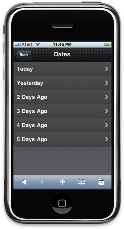
Like the About panel, the Dates panel has a
toolbar with a title and back button. After the toolbar, there is an
unordered edgetoedge list of links. Notice that all of the
links have unique ids (0 through 5) but the same
href (#date)—more on that in a bit.
Next, you have to update the Home panel with a
link to the Dates panel. Add the following line to the Home panel in
index.html:
<div id="home">
<div class="toolbar">
<h1>Kilo</h1>
</div>
<ul class="edgetoedge">
<li class="arrow"><a href="#dates">Dates</a></li>
<li class="arrow"><a href="#about">About</a></li>
</ul>
</div>Figure 4.4. The Home panel now has a link to the Dates panel
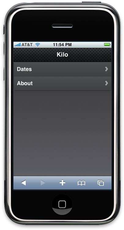
And just like that, we’ve added a new panel to the app (see Figure 4.4, “The Home panel now has a link to the Dates panel”). Clicking on an item on the Dates panel doesn’t do anything yet. Let’s rectify that situation by adding the Date panel.
Adding the Date Panel
The Date panel looks a lot like the previous
panels, with a couple of exceptions (refer to Example 4.4, “The HTML for the Date panel”). Add the HTML for the Date panel right
after the Dates panel, just before the closing
</body>.
Example 4.4. The HTML for the Date panel
<div id="date">
<div class="toolbar">
<h1>Date</h1>
<a class="button back" href="#">Back</a>
<a class="button slideup" href="#createEntry">+</a>
</div>
<ul class="edgetoedge">
<li id="entryTemplate" class="entry" style="display:none">
<span class="label">Label</span>
<span class="calories">000</span>
<span class="delete">Delete</span>
</li>
</ul>
</div>
| The Date panel toolbar has an additional
button. When clicked, this button will display the New Entry panel
(which we have not yet built). I’ve given the link a class of
|
| The other unusual aspect of this panel is
that I’ve defined a list item with the style set to
As you’ll see in a bit, I’m going to use this invisible list item as a template to display entries once they are created. At this point, there are no entries, so the panel will be empty aside from the toolbar. |
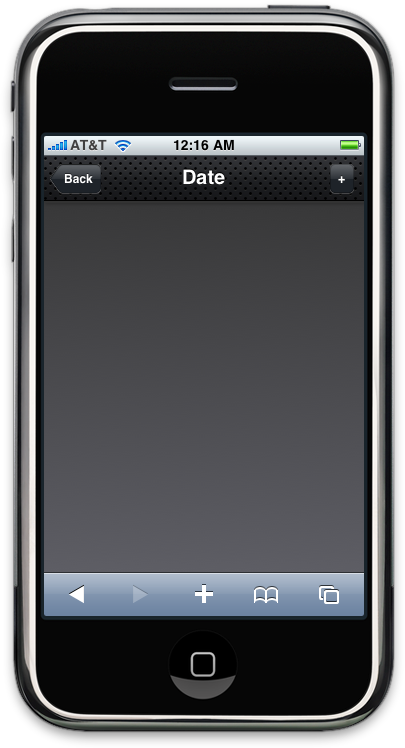
Now that you’ve added the Date panel, clicking any item on the Dates panel will slide the empty Date panel (Figure 4.5, “Apart from the toolbar, the Date panel is empty to begin with”) into view.
Figure 4.5. Apart from the toolbar, the Date panel is empty to begin with
Adding the New Entry Panel
Example 4.5, “The HTML for the New Entry panel”
shows the source code for the New Entry panel. Add this code
to the end of index.html, just before the closing
</body>.
Example 4.5. The HTML for the New Entry panel
<div id="createEntry">
<div class="toolbar">
<h1>New Entry</h1>
<a class="button cancel" href="#">Cancel</a>
</div>
<form method="post">
<ul>
<li><input type="text" placeholder="Food" name="food" id="food"
autocapitalize="off" autocorrect="off" autocomplete="off" /></li>
<li><input type="text" placeholder="Calories" name="calories" id="calories"
autocapitalize="off" autocorrect="off" autocomplete="off" /></li>
<li><input type="submit" class="submit" name="action"
value="Save Entry" /></li>
</ul>
</form>
</div>
| The first thing to point out about the New Entry panel is that instead of having a back button, it has a cancel button. NoteCancel buttons in jQTouch behave just like back buttons, in that they remove the current page from view using the reverse animation of the way it came into view. However, unlike back buttons, cancel buttons are not shaped like a left arrow. I used a cancel button for the New Entry panel because it slides up on the way in and will therefore slide down on the way out. It would be counterintuitive to click a left-pointing back button and then have the panel slide down. |
| This HTML form contains an unordered list
of three items: two text fields and a submit button. Embedding form
controls in an Each of the text inputs has quite a few defined attributes:
|
| The class attribute of the submit input button needs explanation. The iPhone
will display a keyboard whenever your cursor is in a field. The
keyboard has a Go button in the bottom-right corner that submits the
form when clicked. When you are hijacking the submit function as we
are doing here, submitting from the Go button on the keyboard does not
remove the cursor from the active field, and therefore the keyboard
does not slide out of view. To remedy this, jQTouch offers a convenience method that automatically removes
the cursor from the active field when a form is submitted. To take
advantage of this feature, you just add the |
Figure 4.6. The jqt theme does a nice job styling form elements
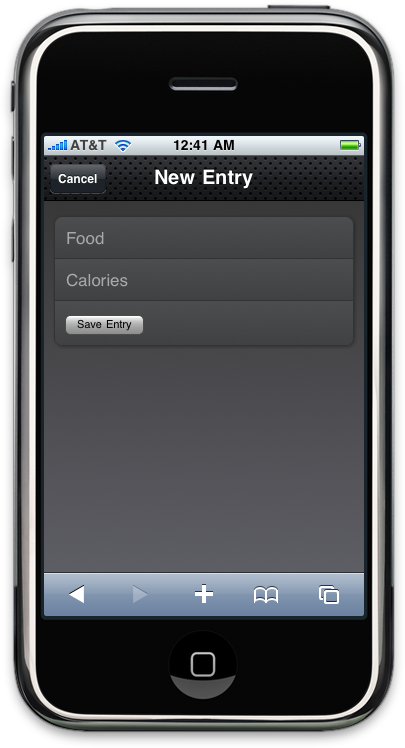
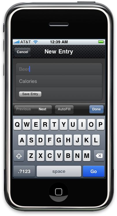
Figure 4.7, “Keyboard data entry with the New Entry form” shows the New Entry form in action. At this point, I’ve done nothing to actually save the entry when the user clicks Save Entry. We’ll cover that in Chapter 5, Client-Side Data Storage.
Figure 4.7. Keyboard data entry with the New Entry form
Adding the Settings Panel
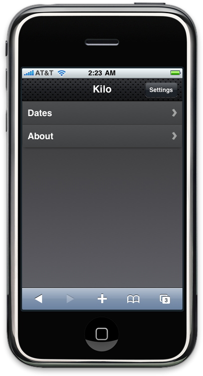
We haven’t yet created a button that will allow users to navigate to the Settings panel, so let’s add one to the toolbar on the Home panel (see Figure 4.8, “The Settings button added to the toolbar on the Home panel”). All it takes is a single line of HTML, shown in bold:
<div id="home">
<div class="toolbar">
<h1>Kilo</h1>
<a class="button flip" href="#settings">Settings</a>
</div>
<ul class="edgetoedge">
<li class="arrow"><a href="#dates">Dates</a></li>
<li class="arrow"><a href="#about">About</a></li>
</ul>
</div>
| This is the line of HTML that adds the
button. Notice that I’ve assigned the |
Figure 4.8. The Settings button added to the toolbar on the Home panel
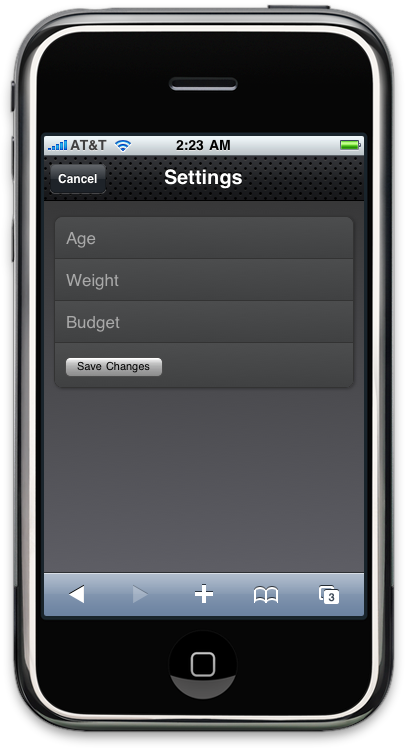
In comparison with the New Entry panel, the HTML for the Settings panel is going to look pretty familiar (Example 4.6, “The HTML for the Settings panel”). There is one more text input and some of the attributes have been omitted or have different values, but conceptually they are identical. Add this to your HTML document just as you’ve done for the other panels. When you’re done, the Settings panel should look like Figure 4.9, “The Settings panel”.
As with the New Entry form, the Settings form does not currently save any of the information associated with it. Its submission handler will be described in the next chapter.
Example 4.6. The HTML for the Settings panel
<div id="settings">
<div class="toolbar">
<h1>Settings</h1>
<a class="button cancel" href="#">Cancel</a>
</div>
<form method="post">
<ul>
<li><input placeholder="Age" type="text" name="age" id="age" /></li>
<li><input placeholder="Weight" type="text" name="weight" id="weight" /></li>
<li><input placeholder="Budget" type="text" name="budget" id="budget" /></li>
<li><input type="submit" class="submit" name="action"
value="Save Changes" /></li>
</ul>
</form>
</div>Figure 4.9. The Settings panel
Putting It All Together
So there you have it. With fewer than 100 lines of code, we’ve created an iPhone-esque UI for a five-panel application, complete with three different page transition animations. Not too shabby, right? See Example 4.7, “The complete HTML listing for the five-panel UI” for a complete listing of the final HTML.
Example 4.7. The complete HTML listing for the five-panel UI
<html>
<head>
<title>Kilo</title>
<link type="text/css" rel="stylesheet" media="screen" href="jqtouch/jqtouch.css">
<link type="text/css" rel="stylesheet" media="screen" href="themes/jqt/theme.css">
<script type="text/javascript" src="jqtouch/jquery.js"></script>
<script type="text/javascript" src="jqtouch/jqtouch.js"></script>
<script type="text/javascript">
    var jQT = $.jQTouch({
        icon: 'kilo.png',
        statusBar: 'black'
    });
</script>
</head>
<body>
<div id="home">
<div class="toolbar">
<h1>Kilo</h1>
<a class="button flip" href="#settings">Settings</a>
</div>
<ul class="edgetoedge">
<li class="arrow"><a href="#dates">Dates</a></li>
<li class="arrow"><a href="#about">About</a></li>
</ul>
</div>
<div id="about">
<div class="toolbar">
<h1>About</h1>
<a class="button back" href="#">Back</a>
</div>
<div>
<p>Kilo gives you easy access to your food diary.</p>
</div>
</div>
<div id="dates">
    <div class="toolbar">
        <h1>Dates</h1>
        <a class="button back" href="#">Back</a>
    </div>
    <ul class="edgetoedge">
        <li class="arrow"><a id="0" href="#date">Today</a></li>
        <li class="arrow"><a id="1" href="#date">Yesterday</a></li>
        <li class="arrow"><a id="2" href="#date">2 Days Ago</a></li>
        <li class="arrow"><a id="3" href="#date">3 Days Ago</a></li>
        <li class="arrow"><a id="4" href="#date">4 Days Ago</a></li>
        <li class="arrow"><a id="5" href="#date">5 Days Ago</a></li>
    </ul>
</div>
<div id="date">
    <div class="toolbar">
        <h1>Date</h1>
        <a class="button back" href="#">Back</a>
        <a class="button slideup" href="#createEntry">+</a>
    </div>
    <ul class="edgetoedge">
        <li id="entryTemplate" class="entry" style="display:none">
            <span class="label">Label</span>
            <span class="calories">000</span>
            <span class="delete">Delete</span>
        </li>
    </ul>
</div>
<div id="createEntry">
    <div class="toolbar">
        <h1>New Entry</h1>
        <a class="button cancel" href="#">Cancel</a>
    </div>
    <form method="post">
        <ul>
            <li><input type="text" placeholder="Food" name="food" id="food"
                 autocapitalize="off" autocorrect="off" autocomplete="off" /></li>
            <li><input type="text" placeholder="Calories" name="calories" id="calories"
                 autocapitalize="off" autocorrect="off" autocomplete="off" /></li>
            <li><input type="submit" class="submit" name="action"
                value="Save Entry" /></li>
        </ul>
    </form>
</div>
<div id="settings">
    <div class="toolbar">
        <h1>Settings</h1>
        <a class="button cancel" href="#">Cancel</a>
    </div>
    <form method="post">
        <ul>
            <li><input placeholder="Age" type="text" name="age" id="age" /></li>
            <li><input placeholder="Weight" type="text" name="weight" id="weight" /></li>
            <li><input placeholder="Budget" type="text" name="budget" id="budget" /></li>
            <li><input type="submit" class="submit" name="action"
                value="Save Changes" /></li>
        </ul>
    </form>
</div>
</body>
</html>Customizing jQTouch
jQTouch allows you to customize its default behavior by
sending a variety of property settings into the constructor. We’ve seen
this previously with icon and statusBar, but
there are many others that you should be aware of. See Table 4.1, “jQTouch customization options”.
Table 4.1. jQTouch customization options