4.2. Introduction to CSS in Mozilla
Now that you have absorbed some of the most important basic aspects of interface design, we can begin to discuss how Mozilla uses CSS and images to make actual interfaces out of the structure defined in the XUL files. Though XUL contains the widgets and structure upon which the interface rests, it is not until at least some basic skin information has been loaded into the XUL that the interface becomes visible and editable by the user. In addition to this, CSS binds XBL widgets to the basic structure of the XUL code, allowing extended content to appear in your document. For more information about XBL, see Chapter 7.
4.2.1. Basic XUL + CSS Interaction
XUL and CSS interact at two basic levels in Mozilla. At the file level, XUL picks up CSS information by explicitly loading CSS stylesheets at runtime. At the element level, selectors bind CSS rules to specific XUL elements or groups of elements. For an XUL element to pick up a style defined in a CSS file, the XUL file must load the CSS file, and an element or group of elements in the XUL must match a selector in the CSS rule. We discuss these basic levels of interaction in the following two sections.
4.2.1.1. CSS and XUL file interaction
Like HTML, XUL loads style information by including a specific processing instruction somewhere at the top of the file. There are various ways to apply style to HTML pages, including the common example below, in which a <link /> element with a URI loads an external stylesheet that holds the style information for the web page.
<link rel="stylesheet" href="../style.css" type="text/css">
In XUL, however, you must use one or more special processing instructions at the top of the XUL file to load the CSS stylesheet information, or skin, into the XUL.
<?xml-stylesheet href="chrome://global/skin" type="text/css"?>
Note that the XUL stylesheet loading supports the use of http:// and file:// type URLs, but most often, the chrome:// type URL is used, which points to files that are available in the application's chrome subdirectory and that are registered with the chrome registry. The example above uses a special feature of this chrome type URL, which resolves directory pointers to files within those directories that have the same name as the directory itself (thus serving as a shorthand for main theme stylesheets). The chrome URL chrome://global/skin, in other words, loads a stylesheet found at chrome://modern.jar:/global/skin/global.css.
 | XUL also supports the use of inline styles, which is style information that is applied to individual elements with a style attribute. However, this practice is generally frowned upon, since it overrides the skin information and makes it very difficult for new skins to be applied correctly. |
Actually, the chrome URL in the example does more than this. Another important function of the chrome registry is that it keeps track of which packages you have installed, which skin you have applied to your application, and resolves URLs like chrome://global/skin into the global skin information for the currently selected skin. If you apply the modern skin, for example, then this URL loads the global skin file from the modern.jar; if you apply the Classic skin, then the chrome URL actually resolves to chrome://classic.jar:/global/skin/global.css instead. This flexibility in the chrome registry abstracts the structure in the XUL files from the skin information and allows you to create and apply different skins.
4.2.1.2. Applying style rules to XUL
In CSS, selector refers to the element or group of elements to which a style rule is bound -- to the thing that is selected for styling. In some cases, the selector is an actual XUL element. The following style rule, for example, says that all XUL <menu/> elements in the XUL file(s) into which this CSS is loaded will have a red background color:
menu {
  background-color: red;
}
In this case, the element selector names an element (menu) directly: all elements of that type match and are styled with the rule. In the next few sections, we describe the main types of selectors and the style rules that can be applied to them. With a couple of notable exceptions (see Section 4.2.3 later in this chapter), the CSS you use with XUL is the same one you use for HTML elements.
4.2.1.3. Inline styles
Another way to apply style to XUL elements is to use inline style rules. Use inline styles with caution. All XUL elements have a style attribute that can be used to define styles directly for that element. In the following example, the style attribute is used (in a common but somewhat deprecated manner) to hide the XUL element -- to apply a style that suppresses rendering of the element (though it still takes up space in the UI):
<menuitem id="e_src"
  label="&editsrc.label;"
  style="visibility: none;" />
When you use inline styles, the syntax does not include the brackets, but you can still add multiple style rules by using the semicolon. The item before the colon is the property, and the item after it is its value. The format of inline styles is as follows:
style="style attribute1: value[; style attribute2: value; etc...]"
The reason why inline styles are frowned upon in XUL and skin development is that they can be extremely difficult to locate and work around when you design a new skin and want to change the appearance of an element that has an inline style. The style attribute takes precedence over styles applied from other sources -- inline styles are the last rule in the cascade of style rules -- so they cascade over styles defined in a skin and may "break" the overall look of that skin.
Besides this problem, many tricks for which application developers use the inline style can be done using XUL attributes. It's very common to use the CSS attribute-value pairs display: none; or visibility: none; to hide elements in order to change what's available from the interface. However, smart XUL developers use the hidden or the collapse attribute instead, thereby keeping structural matters as separate from style matters as possible.
4.2.2. Stylesheet Syntax
Cascading Style Sheets are the blueprints for Mozilla skins. In Cascading Style Sheets, style definitions take the following basic form:
element {
  style attribute1: value;
  style attribute2: value;
  style attribute3: value;
}
For example, the following definition makes all XUL menus appear with a one-pixel border, a light-blue background, and ten-point fonts:
menu {
  border: 1px;
  background-color: lightblue;
  font-size: 10pt;
}
This is an example of using the element itself -- in this case, a "menu" -- as a selector (the item to which the style definition is applied). In addition to the basic element selector and style rules, CSS provides the application of style information to classes of elements, element IDs, and elements with particular attributes or states. The following three sections demonstrate the basic format for these three common style selectors.
4.2.2.1. The element selector
The element selector is the most basic kind of selector. It is just the name of the element to be styled at the front of the style rule. In the previous example, the <menuitem /> element, defined in a XUL file that loads this style rule, will have a light blue background color:
element { attribute: value; }
menuitem  { background-color: lightblue; }
4.2.2.2. The pseudoelement selector
The pseudoelement selector selects a piece of an element for styling. While a selector like menuitem picks up all menu items in a given XUL document, a pseudoelement selector like menuitem:first-letter binds the rule's styles to only the first letter in a menuitem value.
menuitem:first-letter { text-decoration: underline; }
description:first-line { margin-left: .25in; }
The first style rule above gives all menu items to which it applies the look of being accesskey enabled. The second creates an indentation in the first line of a XUL description element's text. Menu access keys let you open and choose items from a menu by using the underlined letters and modifiers (e.g., "F" and <alt> to open the File menu).
4.2.2.3. The class selector
The class selector applies the style rule to all XUL widgets of a given class. In the XUL files that define the structure of Netscape 7, the class is specified with the class attribute (e.g., <menu class="baseline">) and in CSS with the dot notation:
element.class { attribute: value;}
menu.baseline {   border: 0px;   font-size: 9pt; }
In this example, all menus with a XUL baseline class have no borders and a nine-point font size. Note that you can use the class without the preceding XUL element to skin all XUL elements with a given class. In Example 4-1, both the XUL box and the XUL menu pick up the style given in the "redbox" class style definition.
4.2.2.4. The ID selector
The CSS ID selector applies the style rule to a unique XUL element. As with class, the ID is specified in the XUL with an attribute (e.g., <menu id="file_menu">) and in the CSS with the pound sign preceding the ID itself. In this example, the menu with an ID of edit has a red color:
element#id { attribute: value;}
menu#edit { color: red;}
In the example above, both the element type and the element ID are given. You can also identify elements anonymously (though still uniquely) by using just the selector:
#whitey {
    background-color: white;
    margin: .25in;
}
In the case of IDs, these selectors are identical, since IDs need to be unique across the whole XUL file. When you use classes, however, the typeless style rule is a good way to apply your style information to a range of elements.
4.2.2.5. The attribute selector
The attribute selector allows you to style XUL elements with particular attributes or with attributes of a particular value. In Example 4-2, all elements with a disabled attribute set to true will have a light-grey color.
Note that Example 4-2 uses the * character for selecting all elements. This "wildcard" selector can be combined with attribute and other selectors to make a powerful filter in your CSS stylesheets -- but of course, in an example like Example 4-2, it could be omitted and [disabled=true] would still apply to all elements with that attribute set to that value.
Example 4-2 also uses ~= to match attributes that contain the given fragment. In this case, any elements that have an ID with the fragment "my" have text colored red, as when you want to see all your customized elements for debugging purposes.
4.2.2.6. Pseudoclass selectors
Another feature of CSS-2 that Mozilla makes extensive use of is the pseudoclass. In CSS, pseudoclasses are used to represent different states for elements that are manipulated by the user, such as buttons. The states -- represented by pseudoclasses such as active, focus, and hover -- change when the user interacts with an element. The pseudoclasses actually correspond to events on the interface elements.
The : character is used to add these pseudoclasses in the CSS notation:
#forwardButton:hover
{
  list-style-image      : url("chrome://navigator/skin/forward-hover.gif");
}
The pseudoclass is often appended to another style. Since specific CSS style rules inherit from more general rules (see the section Section 4.3.1 later in this chapter for more information about this inheritance), the example above picks up any styles defined for the button with the id of forwardButton (and any class-based information, as well as the basic CSS for a button), but substitutes whatever image is used with this special GIF that represents a button being moused or hovered over.
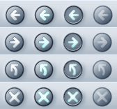
In Mozilla's Modern skin, the pseudoclasses work collectively to give buttons their appearance and behavior. Each of the following button images in Figure 4-3 is associated with a different pseudoclass (or attribute, as we discuss in the next section). As soon as the pseudoclass is changed by user interaction (e.g., the user hovers the mouse over the button), the state changes and the effect is one of seamless transition.
4.2.2.7. Element relation selectors
Contextual subgroups -- elements appearing within other elements, such as italicized text within a <p> element or a <body> in HTML -- can be grouped in CSS, but this is an extremely inefficient way to style XUL. CSS2 also provides ways to group elements for styling based on their relationship in the object model. Table 4-1 lists these relational selectors.
Table 4-1. Relational selectors
|
Selector |
Syntax |
Example |
|---|---|---|
|
Descendent |
ancestor descendent {
 attribute: value;
}
|
toolbar.primary menutitem#F {
  border: 1px;
}
|
|
Parent-Child |
parent > child {
  attribute: value;
}
|
menu#file > menuitem {
  font-weight: bold;
}
|
|
Precedence |
elBefore + elAfter {
  attribute: value;
}
|
menuitem#file + menuitem#edit {
  background-color: black;
}
|
In the descendent example in Table 4-1, the "F" menuitem has a border only when it appears within the toolbar whose class is given as "primary." In the parent-child example, all menu items in a menu with the id "file" are made bold. Using +, the precedence selector says that the "edit" menu should have a black background only when it comes after the "file" menu. You can use these element relation selectors to create longer descensions (e.g., toolbar.primary > menu#file > menuitem#new), but remember that the processing gets more expensive with each new level, and that the descendent operation is particularly processor-intensive.
4.2.2.8. The !important keyword
As you might imagine, when you have a technology with such strong notions of precedence as Cascading Style Sheets (the ID-based style trumps the class-based style, inline style attributes trump those loaded from an external stylesheet, etc.), you may need to identify and set aside certain styles as the most important, regardless of where they are found in the cascade.
This is the role played by the !important keyword. Sitting to the right of a style value, it specifies that style rule should take precedence over all of its competitors and that it should be applied all the time. Example 4-3 demonstrates how no borders are rendered on treecells of the class treecell-editor because of the !important keyword.
You can search for the !important keyword in the LXR Mozilla source code tool and see its use in the Mozilla CSS.
4.2.2.9. The inherits value
CSS uses inheritance all over the place. Inheritance is implicit in the way style rules are applied, stylesheets are organized in the chrome, and skins borrow from one another in Mozilla. However, a special CSS value indicates that the selector explicitly inherits its value from the parent element.
When a CSS property has a value of inherit, that property's real value is pulled from the parent element:
.child {
  color: darkblue;
  height: inherit;
  background-color: inherit;
}
This block specifies a dark blue color for the font, but the values of the other two properties are inherited from the parent. In many cases, this has the same effect as not specifying any value at all for the child and letting the style rules above the current one in the document inheritance chain cascade down. However, not all style rules are inherited. Properties such as !important, left, and height are not inherited automatically by child elements, so you must use the inherit keyword to pick them up.
4.2.2.10. Box layout properties in CSS
People sometimes get confused about the various element spacing properties in CSS, such as border, padding, and margin. Though they work together a lot and often affect or overlap one another, these properties specify different things, as Table 4-2 shows.
Table 4-2. CSS spacing and layout properties
|
Property group |
Description |
Display |
|---|---|---|
padding |
Defines the space between the element's border and the content in the element. td {padding-left: .25in;}
td {padding-left: .0125in;}
|
|
margin |
Defines the space around elements. td {margin-left: .25in;}
|
|
border |
Defines the border itself; it can control the thickness, color, style, and other aspects of an element's border. td {border-style: inset;}
td {border-color: blue;}
td {border-left-width: 15px;}
|
|


4.2.2.11. The position property
position is a special CSS property that specifies whether the given selector uses absolute or relative positioning. Unless you set the position property to absolute, you cannot use the related top and left properties to set the position of the current selector within its parent, as the example in Table 4-3 demonstrates. The top and left properties, when activated by the absolute position, specify the amount of distance from the top and left of the document, respectively. You can also set position to fixed to make it stay in one place as other content or UI is scrolled or moved.
Table 4-3. The position property
|
Example |
Display |
|---|---|
<style>
#abdiv {
 position: absolute;
 top: 20px;
 left: 70px;
 background-color: lightblue;
}
#regdiv {
 background-color: lightblue;
}
</style>
<div id="regdiv">other div</div>
<div id="abdiv">abdiv</div>
|
|

4.2.3. Special Mozilla Extensions
Mozilla skins extend upon the CSS standards in just a few notable ways. These Mozilla CSS extensions take the form of special selectors and properties with the special -moz- prefix, indicating that they are not part of the actual CSS specifications. You can find a complete list of these CSS keywords by searching for the file nsCSSKeyWordList.h in LXR.
Generally, these extensions are used to define CSS style and color values that are hardcoded into the C++ code and available for reuse in particular places in the Mozilla themes. You can use a few -moz- extensions, such as properties or special values or even, in some cases, style-related attributes in the XUL (e.g., span[-moz-smiley="s1"], which grabs span elements in the HTML editor whose -moz-smiley attribute is set to s1 and styles them accordingly). Actually, you can use any value in that CSS keyword list. Trial and error or a look in the C++ code will reveal what these values are. The values, like -moz-fieldtext and -moz-mac-menushadow, usually refer to actual color values. A list of some Mozilla CSS extensions appears in Table 4-4.
Table 4-4. Mozilla CSS extensions
|
Property |
Description |
|---|---|
-moz-appearance |
Specifies that the element should appear, as much as possible, as an operating-system native. |
-moz-opacity |
Controls the opacity of any styleable element with a percentage value. The following example style rule creates a class of buttons that are only half visible above their backgrounds: .op-butt {
-moz-opacity: 50%;
}
|
-moz-binding |
The property for binding XBL to XUL. The value of -moz-binding is a URL pointing to the section in an XML bindings file where the XBL is defined: new-widget {
-moz-binding:
chrome://xfly/bindings/extras.xml#super-button;
}
|
-moz-border-radius, -moz-border-radius-bottomleft, -moz-border-radius-bottomright, -moz-border-radius-topleft, -moz-border-radius-topright |
Puts rounded corners on regular borders. The degree of rounding depends on the number of pixels you assign. For example, if you set this property to 2px, you get a slightly rounded border, but if you set it to 8px, you get a very round border. |
-moz-border-colors, -moz-border-colors-bottom, -moz-border-colors-left, -moz-border-colors-right, -moz-border-colors-top |
Sets the border colors on the various sides of an element. |
-moz-user-focus |
Indicates whether the given element can have focus. Possible values are normal and ignore. |
-moz-user-select |
Indicates whether the given element can be selected. Possible values are none and normal. |
-moz-smiley |
This is typically given as an attribute to the span element in the HTML in a composer window and can be set to a value such as s5 to pick up the laughing smiley image, to s6 to pick up the embarrassed smiley image, and so on. See the following source file for the values that can be set for this special property: http://lxr.mozilla.org/seamonkey/source/editor/ui/composer/content/EditorContent.css#77. |
-moz-image-region |
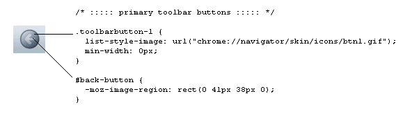
This was added to optimize the way image resources are used in the Mozilla skins. The value of the -moz-image region is a set of coordinates that designate an area within an "image sheet" that should be used as an icon in the user interface. The following CSS style definition specifies the top- and leftmost button in the btn1.gif image sheet used in Figure 4-3 to use as the default icon for the Back navigation button: .toolbarbutton-1 {
list-style-image: url("chrome://navigator/skin/icons/btn1.gif");
min-width: 0px;
}
#back-button {
-moz-image-region: rect(0 41px 38px 0);
}
Of the two default skins, these image sheets are found only in the Modern skin. They are gradually making their way into the skins; as of this writing, there are three or four image sheets in the Modern skin -- each corresponding to an area, toolbar, or set of buttons in the browser. |
-moz-box-align |
Sets the alignment for a XUL element from CSS. Possible values are start, center, end, baseline, and stretch. |
-moz-box-direction |
Sets the direction of a box's child elements. Possible values are normal and reverse. |
-moz-box-flex |
Sets the flexibility of an element relative to its siblings. The value is an integer. |
-moz-box-flexgroup |
Specifies that a group of elements have the same flex. The value is an integer. |
-moz-box-ordinal |
Specifies the order of an element relative to its peers in a container. By default, the value of this property is set to 1. When you set a new value, you can change the order, as in this example, which promotes the "View Source" menu item to the top of the menu by demoting the other two: <style>
#q { -moz-box-ordinal: 0; }
</style>
<menu>
<menuitem id="e" label="e" />
<menuitem id="v" label="v" />
<menuitem id="q" label="q" />
</menu>
</window>
You can also give elements the same ordinal value in CSS and group them, making sure they are not split by new, overlaid items. |
-moz-box-orient |
Sets the orientation of a container element. The value can be either horizontal or vertical. |
-moz-box-pack |
Packs the child elements of a container at the start, center, or end. |
4.2.4. Referencing Images in CSS
Another basic function of the CSS in any Mozilla skin is to incorporate images into the user interface. A Mozilla skin can contain literally thousands of images, which are all referenced from particular style statements in the CSS. It's common for a single element to point to different versions of an image to reflect different states -- as when a second image is used to give a button a pushed-down look as it is clicked -- to create dynamism and provide feedback to the user. Example 4-4 shows the following two style statements handle the regular and active -- or depressed -- states, respectively.
In Example 4-4, the second of the two definitions inherits from the first, so it implicitly includes the arrow.gif as a foreground image. The second style definition says that when the XUL button of class regular is active, the image button_pushed.gif is used in place of regbutton.gif for the background.
Example 4-4 also illustrates the two common stylesheet properties that reference images: list-style-image and background-image. The list-style-image property specifies an image to go in the foreground of the selector; the background-image property specifies a separate image for the background. The availability of these two properties allows you to fine-tuning the images used to style the UI, as in this example, where the arrow icon is preserved and the wider, underlying button is swapped out.
In fact, the navigation buttons in the Modern skin are created by using both properties. In this case, the background is the basic round disk as seen in Figure 4-4, defined in the toolbarbutton-1 class in communicator\skin\button.css, and the list-style-image is the arrow portion of the button, defined in the button ID and sliced out of a button image sheet with the special -moz-image-region property (see Section 4.2.3 later in this chapter for a description of image sheets).
4.2.5. Menu Skinning
As an example of using CSS in applications, Example 4-5 combines many common selectors described in this chapter in a set of rules for defining the look and basic behavior of menus. The CSS handles the basic look of the menus, their color and style, the look of the menu items when they are hovered over, and the look when they are selected.
When you hover over any of the items in the menu generated by the code in Example 4-5, they display a border. When you select the item, it appears momentarily with a dark gray background and white lettering, like reverse video. The Quit menu item, unlike others, appears with a black background. Note that it also picks up the same white lettering as the other items of the m class, since this style information is inherited.