![[DBPP]](pictures/asm_color_tiny.gif)


![[Search]](pictures/search_motif.gif)
Data transformation and visualization tools transform raw data collected during program execution to yield data and images more easily understood by the programmer. In this section, we provide a general discussion of transformation and display techniques, indicating which are useful for which purposes. In the next section, we present examples of specific tools and describe specific transformations and display formats.
A typical profile provides information about the time spent in each procedure on each processor, the number of times each procedure is called, the number of messages generated on each processor, the volume of these messages, and so forth. Data reduction techniques can be used to reduce this multidimensional data to a smaller number of dimensions, and various forms of display can be used to visualize both the original and the reduced data.
Zero-dimensional (scalar) data are of course trivial to display, consisting of a single number: total computation time, total number of messages, mean message size, and so forth. However, numbers of this sort provide relatively little insight into program behavior. For example, we may notice that total communication volume is greater than expected. This observation may stimulate us to ask several questions. Is the additional communication concentrated in a subset of the processors? Is it concentrated in a single procedure? In which phase of the computation does it occur? More data are required if we are to answer these questions.
The histogram is often a convenient display format for one-dimensional data. If the number of processors is large, the size of a histogram can be reduced by binning, in which case histogram bars represent the number of processors (or procedures or whatever) that have computation time in a specified range. Two-dimensional data can be displayed using color and a two-dimensional matrix. For example, in Plate 7 and Plate 8
color is used, respectively, to indicate execution time per procedure per processor, and communication volume between pairs of processors.
Plate 7 is not available in the online version.
Plate 8 is not available in the online version.
Trace data can often be reduced to one, two, or three dimensions and then displayed using the histogram techniques described in Section 9.3.1. For example, we can plot communication volume or efficiency as a function of time, or plot histograms of trace values. Other forms of display can provide more detailed views of temporal dependencies between different processors and program components by sacrificing scalability and abstraction for detail. We describe just two displays of this sort; others are illustrated in later sections.
The Gantt chart is a horizontal bar chart in which each bar represents the status of each processor as a function of time (Plate 8 and Plate 12).
Bars can simply represent status (computing, communicating, or idling) and/or indicate the program component or procedure that is executing on each processor at a particular time. A Gantt chart can highlight unexpected dependencies between program components. Note that dependencies inferred from these sorts of displays are valid only if the computer and performance tool that we are using ensure that times recorded for events occurring on different processors are consistent. This will generally be the case if we use the performance tools described in this chapter, as these all incorporate appropriate clock synchronization logic.
If we augment a Gantt chart by drawing lines to connect corresponding send and receive events on different processors, we obtain a space-time diagram , illustrated in the lower part of Plate 8.
A space-time diagram can make it easier to infer temporal dependencies, because it is often possible to identify the specific communication event for which a processor is waiting and hence idle.
In data-parallel languages such as HPF and pC++ , performance analysis is simplified by the fact that each processor typically executes the same program. On the other hand, the semantic gap between parallel program and executable code is particularly high. Apparently innocuous assignment statements can cause large amounts of communication if distributions do not match, while a compiler may restructure code to eliminate other communication operations that the programmer may assume will occur. Similarly, the mapping of computation to processors may not be obvious to the programmer. Therefore, low-level information about computation and communication tends to have only limited value.
Performance tools for data-parallel languages both can take advantage of the SPMD nature of data-parallel computation and overcome the semantic gap by relating performance data to the program statements concerned. For example, they can label the source code with communication costs or can color data arrays to indicate the computation costs and communication volumes associated with each element. These forms of display can involve a considerable degree of compiler assistance and/or postprocessing, since in many cases the executed code has been transformed out of recognition. This approach is illustrated in Plate 9,
which shows a communication summary produced by Thinking Machine's Prism performance tool. The program illustrated is the Gaussian elimination code used as a case study in Chapter 7. The plate indicates sources of communication in a data-parallel Fortran program and the relative cost of each communication operation.
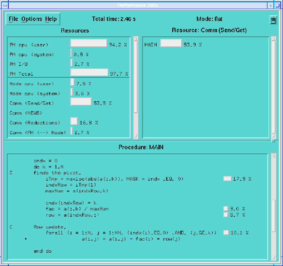
(GIF 27721 bytes; RGB 295002 bytes.) Plate 9: Thinking Machine's PRISM performance tool, here applied to a Gaussian elimination algorithm. Image courtesy of D. Reed.
© Copyright 1995 by Ian Foster