3.9. The Box Model
The box model is the basic layout mechanism in XUL. Although it's possible to position your widgets in a window by using layout attributes of the window (a box-based container), using boxes allows you to arrange, nest, and position your widgets the way you want. The box model defines:
How much space elements take up in relation to their siblings and containing elements
The orientation of elements
The relationship of elements to one another
Space can be determined in a number of ways. You can constrain size by putting fixed sizes on windows or the widgets contained therein. Or you can let the natural sizes take effect and let the elements size themselves according to their content. Applying boxes to your layout uses space efficiently and optimizes the layout of your XUL windows and dialogs.
3.9.1. Box Attributes
The XUL element <box> defines a number of attributes and some implicit behavior for layout. Boxes can be oriented within other boxes to define the general layout of the UI. Some boxes stretch to fit the space available within the top-level window or their containing element; others take only as much space as needed to display their own children.
Attributes on the box and its child elements determine the flexibility of the content contained within the box, the way that windows are resized, and the alignment of elements, as Table 3-4 describes.
Table 3-4. Common box attributes
|
Attribute |
Values |
Default value |
Description |
|---|---|---|---|
|
align |
start | end | center | baseline | stretch | inherit |
stretch |
Determines how the children are aligned in conjunction with the box's orientation |
|
flex |
<number> | inherit |
0.0 |
Determines the flexibility of the contained elements, which depends on their particular flex values |
|
style |
CSS property and value |
N/A |
Applies CSS style settings to the box |
|
orient |
horizontal | vertical | inline-axis | block-axis | inherit |
inline-axis |
Determines the layout of the children of the box |
|
pack |
start | end | center | justify | inherit |
start |
Determines the use of remaining whitespace once all other objects are stretched to their full size |
|
direction |
normal | reverse | inherit |
normal |
Determines the direction of the children in the box |
|
ordinal-group |
<integer> | inherit |
1 |
Controls the order in which widgets appear in a box |
The attribute names in Table 3-4 (with the exception of style) are defined directly on the box. But there are also CSS versions of these properties that use the prefix box-. pack becomes box-pack when it's defined in CSS, for example. These properties are not part of the CSS specification, so you may need to go one step further and use the format -moz-box-pack. These special extensions to CSS are described in the section Section 4.2.3 in Chapter 4.
The most commonly used attributes are orient, align, and pack. The orientation of the children of a box can be either vertical or horizontal. The default is horizontal for a plain <box>, but not for all box containers (<groupbox> is vertical). The <vbox> and <hbox> conveniences were created to bypass the use of this attribute and increase box layout efficiency in the rendering phase.
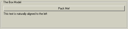
Here is a look at how the pack and align properties can effect the layout of widgets. First, here is a bit of code with no constraints:
<vbox style="width: 90px; height: 90px">
  <button label="Pack Me!" />
  <label value="This text is naturally aligned to the left" />
</vbox>
This XUL does not tell the button and text inside where to go, so they occupy the default positions shown in Figure 3-9.
Here is a changed box definition with the align and pack attributes set:
<vbox style="width: 90px; height: 90px" align="right" pack="center">
A noticeable visual difference can be seen in Figure 3-10.
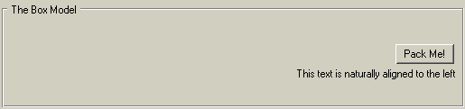
The align value moves the items to the right of the box, while simultaneously constraining the button to fit only the text label, making better use of space. pack centers both the items horizontally.
3.9.2. Box-Like Containers
The basic XUL box is represented by the <box>, <vbox>, and <hbox> elements, but several more XUL elements are designed as box-like containers. They include:
<radiogroup>
<scrollbox>
<tabbox>
<groupbox>
<toolbox>
<stack>
<deck>
<listbox>
<popup>
<statusbar>
Descriptions of the tabbed box and the group box follow. Additional information on other box widgets can be found in the XUL element reference in Appendix C.
3.9.2.1. Tab box
Tab boxes may contain only <tabs> and <tabpanels> elements, as shown in Example 3-16. Beyond this, there is no restriction on the content that can go into the panels themselves. For the panels to display content properly, there have to be the same number of children and tabs in the tab panels.
Example 3-16 shows the main controls used to create a simple three-tab control with content elements on each panel. The tabs are associated with the appropriate panels by their order within the containing element.
3.9.2.2. Status bar
A status bar is a horizontal box that appears on the bottom of the screen in many Mozilla applications, including the Mozilla browser itself. It can be used for the same purpose in your application if you need it. The <statusbar> element typically contains icon images and text within one or more <statusbarpanel> elements:
<statusbar id="ch3-bar" persist="collapsed">
  <statusbarpanel class="statusbarpanel-iconic" id="book-icon"/>
  <statusbarpanel id="status-text" label="Thanks for reading chapter 3"
      flex="1" crop="right"/>
  <statusbarpanel class="statusbarpanel-iconic" id="book-icon-2"/>
</statusbar>
As a box, the statusbar behaves like any other box widget. The panels constrain to their natural sizing and layout attributes such as flex situate all elements within. In this example, the icons appear to the left and right of the bar, while the flexed text panel takes up the remaining space.
3.9.3. Additional Box Features
Boxes work in concert with a few other special elements, including the <separator> and <spacer>. These two elements create space between widgets in a box and can be horizontal or vertical depending on the orientation of the box. The separator is a visible divider and the spacer is invisible space. The default size for both of them is small, but they can be given flex, width, and height values like other elements. Used correctly, they can make all the difference in how your UI looks.
3.9.3.1. Visibility
You can control the visibility of a box by showing and hiding it in different circumstances -- toggling the appearance of an advanced panel in a dialog, for example, or text that appears after a user selects something. One way to control visibility is to use the collapsed attribute to cede the space taken by the box to surrounding elements:
<box flex="1" collapsed="true" />
You can also set the CSS display property to none:
<box flex="1" style="display: none;" />
The document is rendered as though the element did not exist in the document tree. If you want the space to be maintained but the element to remain invisible, you can use the CSS visibility property:
<box flex="1" style="visibility: hidden;" />
Rendering the space but not the content avoids flicker and UI wobbles when content is being shown and hidden intermittently.
3.9.3.2. Overflow
A value of scroll or auto for the CSS overflow property ensures that a scrollbar appears and that the content can be accessed even when it can't be displayed. A value of hidden hides the content outside of the box. The content is not clipped if this value is set to visible, but it will be visible outside the box.
<vbox flex="1" style="height:39px;overflow: auto;">
This snippet constrains the height of the box but displays a scrollbar when the content exceeds the available space.
3.9.4. Stacks and Decks
A variant and special model of the box is available in the stack and deck elements. Both are boxes, but they lay their children out one on top of the other like a stack of crates or a deck of cards, rather than sequentially.
A stack shows all its levels at once. If you have transparency or extra space on one level, you can see underneath. Stacks are useful when you want to add shadows in your content or if you want to create transparent layering effects. If you have a bird's eye view of XUL content, you can see the elements on each layer flowing into each other, like the text on top of an image in Figure 3-11.
<stack>
  <image src="logo5.gif"/>
  <label value="BUZZ ..."
      style="font-weight:bold; font-size: large" top="70px" left="140px"/>
</stack>
Decks show only one level at a time. In Example 3-17, logo3.gif is foremost because the selectedIndex attribute on the deck is set to 2 in a zero-based index.
As Example 3-18 shows, it is possible to switch pages using the DOM by changing the index on the deck. The setAttribute method changes the selectedIndex attribute of the deck element in script and can be executed, for example, when a user clicks a button or in other places in the interface.
When applied to the deck in Example 3-17, the code in Example 3-18 continuously flips to the next image in the sequence and returns to the top of the deck when the last image is reached. In this case, there are only three images, so a maximum of 2 is put on the index check.
3.9.4.1. Moveable content
At one point in XUL toolkit development, an element called the bulletinboard allowed you to layer child elements one on top of another like its real-world namesake. You could change the coordinates of the child elements on the screen by using the top and left attributes. The order of the children in the XUL content determines the z-ordering on screen. As stack developed and took on much of this functionality, bulletinboard was officially deprecated and some of its properties were merged back into the stack element. As Example 3-19 demonstrates, this was a boon for the stack element, which can use coordinates to position children like its ancestor. The two boxes in the example are positioned at varying distances away from the stack's top left corner.
You can position the two boxes, each containing an image, in any of the following ways:
By placing the top and left attributes directly on the tags
By setting them via stylesheets using the CSS properties top and left
By using DOM calls in your script
Here is some script used to switch the position of the boxes from one location to another by changing the top and left attributes:
Box1=document.getElementById("box1")
Box1.setAttribute("top","40px")
Box1.setAttribute("left","50px")
Box2=document.getElementById("box2")
Box2.setAttribute("top","20px")
Box2.setAttribute("left","40px")